






A spacecraft the size of a large refrigerator, carrying three robotic arms and about 60 kilograms of xenon, got to within roughly 12 to 15 kilometres of its target. That is between about seven and a half and nine miles, which in orbital terms is close enough to see your destination and not nearly close enough to touch it. It needed to close that gap, reach out, grab a twenty two year old NASA observatory by a pair of handling flanges never designed to be gripped in space, and shove it back up into a higher orbit.
It never got there. A reaction control valve stopped responding, the spacecraft began to spin, and a power circuit switch failure finished the job. The rescue vehicle, called LINK, built by a company called Katalyst Space under a NASA contract worth around 30 million dollars, was deliberately brought down into the atmosphere and destroyed in late September. Its target, the Neil Gehrels Swift Observatory, is still up there, still working, and still falling.
Kieran Wilson, who was LINK’s principal investigator, listed the failures himself rather than waiting for anyone else to do it, and said flatly that they came very, very close. He also noted, with the kind of gallows accuracy engineers reach for, that he remained principal investigator for another twenty four hours or so until the thing reentered.
This story is easy to write badly in two opposite directions. One version is the debacle: 30 million dollars of public money burned up over the Pacific, nothing to show for it. The other is the noble try: brave people reaching for something hard and failing beautifully. Both are lazy, and both skip the part that is actually useful, which is what specifically broke, what that tells anybody who wants to service a satellite that was never built to be serviced, and what now happens to a working telescope that nobody can reach.
Start with why Swift was worth 30 million dollars of rescue attempt. It launched in November 2004 on a Delta II from Florida, into an orbit with a perigee of about 585 kilometres and an apogee of about 604. Its job was gamma ray bursts, which are the brightest explosions in the universe and, before Swift, were among the most frustrating objects in astronomy. A burst lasts seconds. By the time anyone could point a telescope at roughly the right patch of sky, the thing was gone and the position was vague.
Swift’s whole design was about collapsing that delay. It detects a burst, works out where it came from, and then slews itself around to put its X ray and ultraviolet and optical instruments on the fading afterglow, fast, while the afterglow still exists. That turned gamma ray bursts from flashes into objects with addresses. It is the reason astronomers can now tie individual bursts to individual galaxies, to supernovae, to the collisions of dense stellar remnants. Swift cost around 500 million dollars to build and launch. Twenty two years later it still works.
That matters beyond gamma ray bursts, because a telescope that can swing onto a target within minutes turns out to be useful for almost anything that changes fast. Swift has spent two decades being the instrument other astronomers call when something flares, erupts, explodes or simply does something unexpected, including following up the sudden events that other observatories and detectors flag. A fast, nimble, well calibrated X ray and ultraviolet observatory is a general purpose tool, and there is not a queue of replacements waiting.
What is killing it is not a broken component. It is air.
Low Earth orbit is not empty. There is a thin residual atmosphere up there, and it pushes back. How hard it pushes depends on the Sun. When solar activity rises, the upper atmosphere absorbs more energy, heats up and expands outward, so a satellite at a fixed altitude suddenly finds itself ploughing through thicker air than it was built for. Drag increases. The orbit decays faster. The models that planned Swift’s lifetime in the early 2000s assumed a certain amount of this, and the actual solar cycle around the 2024 maximum delivered more.
The numbers tell it plainly. Swift started at roughly 600 kilometres. By 2026 its orbit had come down to a perigee of about 373 kilometres and an apogee of about 378. Without a boost, the assessment ahead of the rescue mission gave it a ninety percent chance of reentering before the end of 2026.
Here is the part that makes the whole situation faintly absurd. Swift has no propulsion of its own to raise its orbit. It has no refuelling port, no docking fixture, no grapple fitting, nothing. This is not an oversight by the people who built it. In 2004, nobody designed science satellites to be serviced, because there was no way to service them. Hubble was the exception and Hubble got a space shuttle. For everything else the plan was simple: it works until it does not, then it falls down. An entire generation of still-functioning hardware is in orbit under that assumption.
That assumption is now a growing problem rather than a historical quirk. The same solar conditions dragging Swift down are dragging on everything else in low orbit, and a good deal of what is up there is ageing hardware that still works, still produces data, and has no way to raise itself. Shawn Domagal-Goldman, who directs NASA’s astrophysics division, made the affordability case directly: pushing an existing observatory back up is a fraction of the cost of replacing it. The catch is that nobody has yet demonstrated that it can be done to a spacecraft built before anyone thought to leave a handle on it.
So NASA tried something it had not tried before. In September 2025 it awarded Katalyst Space Technologies a contract, reported at around 30 million dollars, under a small business programme mechanism, to build and fly a spacecraft that could go up and physically push Swift higher. For scale, that figure is roughly six percent of what Swift itself cost. It is a fraction of what building a replacement would run. On those economics the attempt was worth making even at substantial risk of failure, and the people who approved it were explicit that they understood they were accepting a large risk.
LINK was built fast. It weighed about 425 kilograms, carried 60 kilograms of xenon propellant, three Hall effect thrusters for the slow efficient orbital work and a set of reaction control thrusters for attitude. Its business end was three parallel robotic arms, each with its own lidar sensor and grippers, in an arrangement described as a split Stewart platform. The plan was to use all three for control, though the design could in principle have captured with one.
The capture plan itself is the most interesting piece of engineering in the story. Since Swift has nothing built for grabbing, the team went looking for something on the spacecraft strong enough to take the load, and settled on the ground handling flanges on the satellite bus, which are the fittings technicians use to move the spacecraft around on Earth. LINK was supposed to approach, inspect visually and with lidar from a few tens of metres out, check that the flanges were not obstructed by degraded multi layer insulation or anything else twenty two years in orbit might have done to the surface, and only then make contact. The whole docking sequence was rehearsed on an air bearing table on the ground using a mock up of Swift.
LINK launched on 3 July 2026, at 08:36 UTC, from Kwajalein Atoll in the Pacific, on a Pegasus XL rocket dropped from the Stargazer carrier aircraft at around 39,000 feet. It took three weather scrubs and a technical delay to get off. It was the last planned flight of the Pegasus, a vehicle chosen because, as Katalyst’s chief executive Ghonhee Lee put it, it was the only rocket that could hit the orbit, the schedule and the budget at once. Katalyst got a discount on a rocket originally built for a customer who never flew it.
The launch worked. Separation was confirmed. Then things began to come apart in stages, and the sequence matters more than the headline.
About a week into the mission there was a failure of a reaction wheel switch on the power side. Reaction wheels are how a spacecraft points itself without spending propellant: spin a flywheel one way, the spacecraft turns the other. Lose them and you are down to thrusters, which burn a finite resource.
By 25 July, LINK had lost attitude control and was tumbling. Investigation found two of its three reaction wheels inoperable and the cold gas thruster system degraded, most likely the result of a temperature spike during an automatic bus reset. The spacecraft was spinning at about nine degrees per second. Over the following weeks the team wrestled that down to about 1.47 degrees per second by 5 August, which is genuinely impressive recovery work on a vehicle that had lost most of its pointing hardware.
Wilson’s account of the end of the capture attempt names an unresponsive reaction control system valve as the start of the chain that spun the spacecraft up, followed by another power circuit switch failure, and it was that combination that ended any possibility of rendezvous and capture. On 19 August, Katalyst gave up on the boost and reframed the mission around rendezvous and proximity operations instead: get close, look at Swift, gather the data, do not attempt contact. The root cause of the original spin was never definitively pinned down.
That is what took it to within 12 to 15 kilometres and no closer.
And this is where the useful part lives, because a failed capture that got that far is not the same as a vehicle that died on the pad. All three electric thrusters fired. The spacecraft changed its orbit as planned. All three robotic arms deployed correctly. LINK photographed its own solar panel in orbit in late August. The propulsion worked, the arms worked, the orbital mechanics worked. What failed was attitude control, twice, through a valve and through power switching.
If you are in the business of servicing satellites, that is a more specific and more valuable result than a general lesson about risk. It says the hard part of grabbing an uncooperative spacecraft may not be the grabbing. It says single point failures in valves and power switching can take out a mission whose headline technology performed. It says a vehicle built on a tight schedule with a modest budget can get within sight of a target it was never certain to reach, which is an argument for trying again rather than against it.
John Von Eepoel, deputy project manager at NASA Goddard on the boost mission, described an organisation that had decided to accept a large risk deliberately, top to bottom, and said the question internally was never whether to do it but how. That is an unusual thing for a space agency to say out loud, and the fact that it was said after the failure rather than before it is the part worth noting.
What happens to Swift now is the piece that has to be stated carefully, because it has not happened yet.
Swift is still observing. Two of its instruments, the X ray telescope and the ultraviolet and optical telescope, were switched back on in late August 2026 after having been configured for the boost attempt, and the observatory went back to work. Jamie Kennea, who led Swift’s science operations from Penn State University and has since moved to Schmidt Sciences, coordinated reorienting the spacecraft to present the smallest possible cross section to the oncoming air and slow its fall. Brad Cenko remains the mission’s principal investigator.
So the telescope is doing science on the way down. It is pointed to minimise drag and still returning data, and nothing about the LINK failure broke anything on board Swift.
The reentry itself is a forecast, not an event. The pre mission assessment put Swift’s chance of coming down before the end of 2026 at ninety percent, and the reporting after LINK’s loss expects it within months. That is a projection built on atmospheric density models and solar behaviour, both of which have already proved harder to predict than the original planners assumed. Nobody has announced a date. An uncontrolled reentry of a spacecraft this size is expected to break up in the atmosphere. When it actually happens, and precisely where, is not knowable now.
What is knowable is the shape of the thing. A telescope that changed how a whole class of cosmic explosion is studied is falling because the Sun was busier than the models said. A rescue was attempted for about six percent of the telescope’s original cost, using a rocket on its final flight and a spacecraft with arms designed to grip fittings meant for a loading dock. It got within nine miles. A valve and a switch stopped it, and the people responsible named both without being asked.
Swift will keep taking data until the air gets too thick to point in. That is a strange and slightly undignified way for a great instrument to finish, and it is also, on the evidence, exactly how the people operating it intend to spend what is left: working the whole way down.
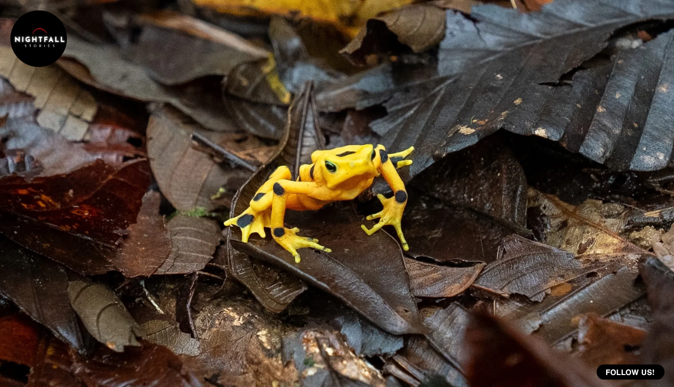
One hundred captive bred Panamanian golden frogs were carried up into the hills above El Valle de Anton and placed inside mesh pens on the forest floor, in the same kind of ground their ancestors had lived on before the species vanished from the wild in 2009. Twelve weeks later, roughly seven out of every ten were dead, killed by the same fungal disease that had emptied those hillsides in the first place.
Here is the part that makes this worth your time. The team that ran the trial did not bury the figure. Roberto Ibanez, who directs the Panama Amphibian Rescue and Conservation Project, and Brian Gratwicke, a conservation biologist with the Smithsonian’s National Zoo and Conservation Biology Institute, put it out in plain numbers, and then used it to argue against the thing their own programme had spent nearly twenty years preparing to do. The survivors were let out of the pens. And the strategy shifted away from putting more frogs back into the places the species used to live.
That is not a sad twist on a hopeful release story. It is also not a failure. It is a conservation programme discovering, at considerable emotional cost to the people holding the containers, that its preferred plan does not work yet, publishing the proof, and changing course on the strength of it. That sequence is rarer in conservation than you might expect, and it is the actual story here.
To understand why a hundred small yellow frogs matter this much, you have to understand what Atelopus zeteki is in Panama. It is not a species the general public has to be persuaded to care about. In 2010 a law was passed making the golden frog a national symbol. There is an annual day for it, with parades through the streets of El Valle de Anton, the town at the foot of the very hills where this trial took place. The frog turns up in handicrafts and local design. It is, in the most literal sense, a national emblem that stopped existing outside of glass tanks.
The thing that removed it was a fungus called Batrachochytrium dendrobatidis, usually shortened to Bd and the cause of a disease called chytridiomycosis. It moved through southern Central America from the late 1980s onward, travelling along the mountain chain, and reached the El Valle region in the mid 2000s. Accounts differ slightly on the exact year, with the Smithsonian’s own material putting the arrival around 2004 and the rescue project’s history page putting it at 2006, so the honest version is the middle of that decade.
What the fungus does, at the level that matters for a population rather than an individual, is attack the skin. For an amphibian, skin is not a wrapper. It is a working organ that handles water and salts and a great deal of the animal’s basic chemistry. Disrupt it badly enough and the animal cannot keep its internal balance. Scale that up across a stream valley and you do not get a gradual decline with survivors hanging on in pockets. You get a collapse that runs through a site in a single season.
The scale of what Bd has done globally is worth holding in mind, because it explains why a hundred frogs in pens on one hillside is treated as a serious experiment rather than a local curiosity. By one widely cited assessment published in 2019, the fungus had been implicated in the extinction of around ninety amphibian species worldwide and in the decline of at least four hundred and ninety one more. It is routinely described as the most destructive wildlife disease on record. Nobody has a cure for it in the wild. You cannot spray a mountain range, and a treatment that works in a tank does not transfer to a watershed.
Golden frogs were among the worst hit, because almost everything about them suited the fungus. They lived in cool, wet, fast running streams in the central mountains, which is close to the ideal temperature band for Bd. They were conspicuous, slow moving and gathered at streams to breed, which is exactly how a skin pathogen gets passed around. Researchers recorded severe chytridiomycosis declines at every one of the species’ known remaining sites. The last confirmed wild record was in 2009.
It is worth being precise about that, because sources use two different phrases. Some say the species is extinct in the wild. The narrower and more defensible statement, and the one the rescue project itself uses, is that the golden frog has not been recorded in the wild since 2009. Those are not the same claim, and in a story about a team being careful with its own numbers, it would be poor form to be careless with that one.
What saved the species from going out entirely was a decision made while the collapse was still happening. Animals were collected out of the wild and taken into captivity, a strategy the field bluntly calls an ark. It sounds dramatic. In practice it is close to two decades of unglamorous husbandry: water chemistry, feeder insects, temperature logs, quarantine, breeding records, and the slow genetic bookkeeping needed to keep a captive population from becoming a collection of cousins. The programme now holds more than a thousand adult golden frogs across more than fifty participating institutions in the United States and Canada, managed under a formal survival plan, alongside the Panamanian facilities run through the rescue project.
There is a second cost to an ark that rarely gets counted, which is what it does to the animals. A frog raised in a tank has never hunted a wild insect out of leaf litter, never dealt with a real temperature swing, never encountered the bacterial community that lives on a wild frog’s skin. Captive amphibians tend to lose the microbial and chemical defences their wild relatives carry, partly because the diet is different and partly because the environment is clean by design. Twenty years of successful breeding can therefore produce a healthy animal that is, in the specific sense that matters outdoors, naive.
An ark buys time. It does not solve anything. And the problem with this particular ark has always been obvious to everyone inside it: the fungus that emptied the hills is still in the hills. It did not pass through and leave. Bd persists in those watersheds, in other amphibian species that tolerate it better, in the water itself. You cannot simply open the doors on twenty years of careful breeding and hope the landscape has forgotten.
Which is why the trial was built the way it was. The frogs did not go straight out onto open ground. They went into mesocosms, which is a technical word for a very practical object: outdoor pens, built on real forest floor, with leaf litter layered in the bottom that came with its own insect life for the frogs to hunt. The mesh held the frogs in and kept predators out. Everything else about the enclosure was deliberately the real world, including the fungus.
That design is what makes the result usable. A soft release pen is a compromise between a tank, where you learn nothing about survival, and a free release, where you learn something but lose the animals and the data at the same time. In a mesocosm you can count. You know how many went in, you can check them, and at the end of the period you have a number rather than an impression.
Gratwicke has been open that the trial was built as a question rather than a rescue. The point was to see what actually happens when captive bred golden frogs are put back into a wild situation: how the disease behaves, how the frogs behave, and whether the animals begin to recover their skin defences. Golden frogs carry potent skin toxins in the wild, enough that a single frog has been described as holding sufficient toxin to kill more than a thousand mice, and there has long been a question about how much of that chemistry captive animals keep or regain once they are back on natural ground and natural food.
That question is not academic. Skin toxins are a defence against predators rather than against fungus, but the broader point behind it is the same: if an animal’s skin chemistry and skin microbiology shift back toward the wild state once it is living on wild ground and eating wild food, then time outdoors is itself part of the treatment, and a release becomes something you build in stages rather than a single event. The trial was set up to find out whether that was happening.
So one hundred frogs went into the pens. The monitoring period was twelve weeks. At the end of it, around seventy percent had died of chytridiomycosis.
It is worth sitting with what that figure means to the people who produced it, without making it prettier than it was. These were not anonymous units. They were animals bred inside a programme where individual frogs are tracked, by staff who have spent years keeping a species alive that no longer exists outside their care, in a town that holds a parade for it. The number was gathered by the same hands that raised the animals.
The contrast that gives the figure its edge came from the same broader programme. Three other amphibian species had been put through release work the previous year: crowned tree frogs, Pratt’s rocket frogs and lemur leaf frogs. They did noticeably better, with the lemur leaf frogs showing what the team described as excellent survivorship. So the seventy percent was not a verdict on soft release as a technique, or on the programme’s competence. It was specific. Other species could be put back on that landscape and live. This one, in this place, could not.
That specificity is what turned a bad result into a usable one, and it points directly at the reason the plan changed.
Bd has a temperature preference. It does best in cool, moist conditions and it struggles as things get warmer. Push the temperature up far enough and the fungus is suppressed. Golden frogs also have a temperature range they can tolerate, and it overlaps with the fungus, which is precisely why the historic sites were such killing grounds. But the two ranges are not identical. If there are places on the landscape that are warm enough to hold the fungus back while still sitting inside what the frog can handle, those places are refuges, and the whole reintroduction problem becomes a question of finding them rather than a question of waiting for the disease to fade.
Gratwicke’s position after the trial was that the data would set the strategy from there, and that earlier modelling had already suggested such climatic refuges might exist. The trial did not discover the idea. What it did was make the idea the main plan instead of a secondary one, by closing off the alternative with a number nobody could argue with.
There is something genuinely uncomfortable in the logic, and it deserves to be said straight rather than smoothed over. A warming climate is, for most amphibians, bad news on every axis: drying streams, shifting breeding seasons, heat stress. For this particular species against this particular pathogen, warmth is the one lever available. The team is not celebrating that. They are using it. A conservation strategy that depends on finding somewhere hot enough to make a disease uncomfortable is a strategy built in a corner, and the people building it know exactly which corner they are in.
The survivors were released fully, out of the pens and onto the hillside. Roughly thirty frogs out of a hundred, carrying whatever it is that let them get through twelve weeks of exposure that killed the rest. Whether that was genetics, skin chemistry, microbiology, luck or some combination is one of the open questions the programme is now chasing, because if the difference can be identified it can potentially be bred for.
The direction of travel from there is away from more releases into the old range and toward identifying and testing climatically favourable sites. Gratwicke framed the next round explicitly as release trials in more climatically favourable places, which is a sentence that quietly concedes the historic sites are off the table for now. For a programme whose entire founding purpose was to put golden frogs back where golden frogs used to be, that is a real concession, published voluntarily, on the strength of its own unflattering data.
It is also worth noting what this story is not. It is not a tidy redemption arc and the sources do not support one. Nobody involved has announced that golden frogs are back. The species still has no confirmed wild population. The ark is still running, still consuming money and staff time and tank space, still dependent on institutions in two countries continuing to care. And the fungus is still out there in the water, indifferent to all of it.
What changed is narrower and more valuable than a happy ending. A conservation programme ran a test that could only tell it something it did not want to hear, heard it, said it out loud with a figure attached, and moved. The seventy percent is not a footnote to a release story. It is the finding. It is the thing that bought the next decade of work its direction, and it cost seventy animals and twenty years of preparation to learn.
Somewhere above El Valle de Anton, around thirty small yellow frogs are living on a hillside their species had been absent from for well over a decade. They are not a recovered population and the people who put them there would be the first to say so. They are the survivors of an experiment designed to be honest, run by people who then published the part that hurt. In a field where plans tend to outlive the evidence against them, that is the result worth paying attention to.
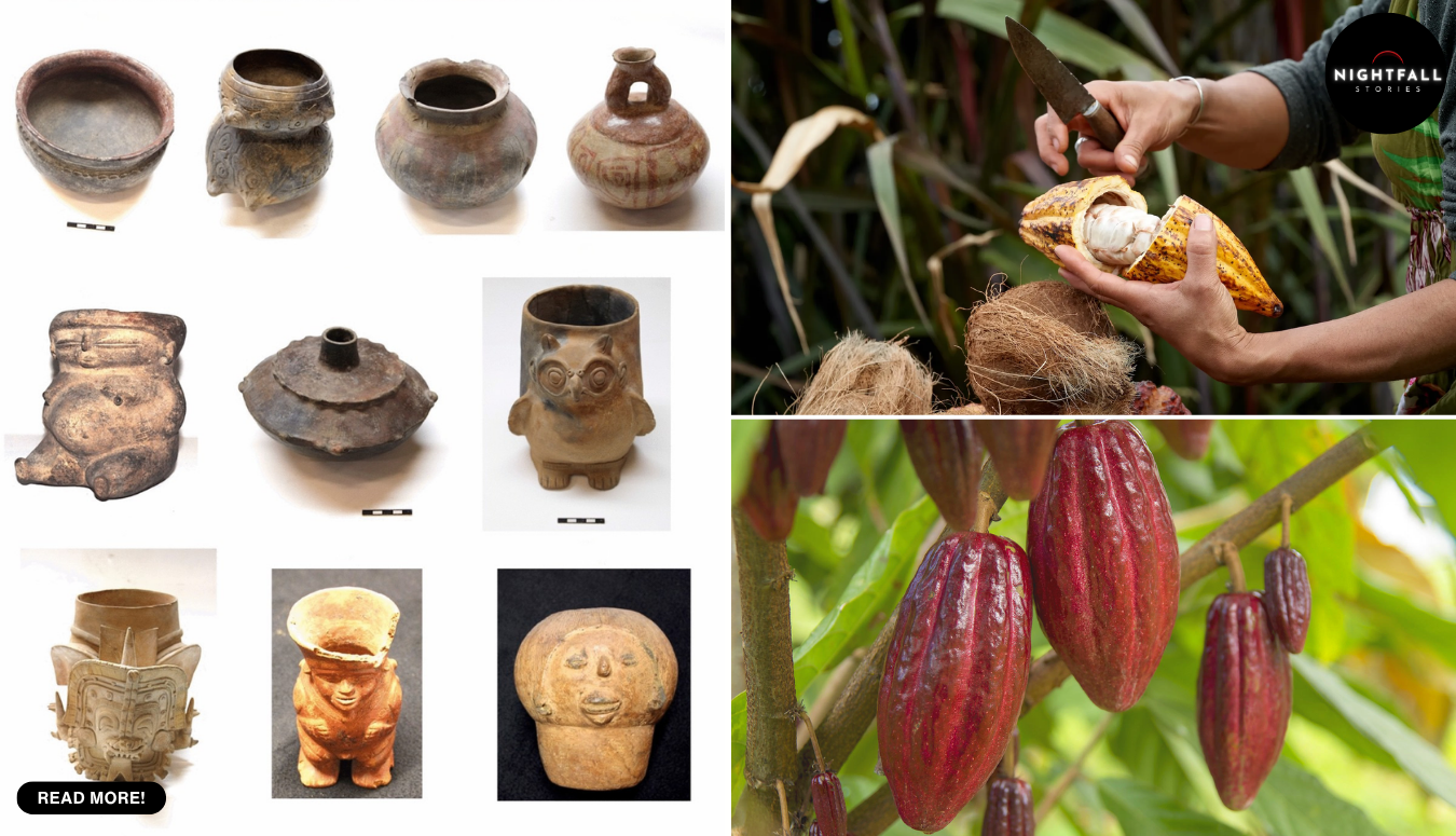
Nine years ago, a team led by the archaeologist Adam King ran thirty one broken pieces of pottery from the Etowah site in Georgia through a chemistry lab and found something that should not have been there. The sherds, soaked for centuries in whatever had been cooked or brewed in them, gave up traces of a family of compounds called methylxanthines. Four of them were being looked for: theobromine, theophylline, caffeine and paraxanthine. Almost half the samples held at least two. Three samples held all four.
That combination is the chemical signature of cacao. And cacao does not grow anywhere near Georgia. It does not grow anywhere in North America above Mexico. The nearest wild and cultivated populations were thousands of miles away, across terrain and water, in Mesoamerica and ultimately in the upper Amazon.
So the obvious conclusion sat there, and the team could not take it, because of a shrub.
Yaupon holly grows all over the southeastern coastal plain. It is a scrubby evergreen with red berries, and its leaves are caffeinated. Southeastern peoples brewed them for centuries into a strong, dark, ceremonial drink that Europeans later recorded under the name black drink. The trouble is that yaupon leaves contain more than caffeine. They carry the same methylxanthines, in combinations that overlap with cacao closely enough that an absorbed residue from one cannot be reliably told apart from an absorbed residue from the other.
That is the whole problem in one sentence, and it is a hard one. A residue test tells you what class of chemistry passed through a pot. It cannot tell you which plant the chemistry came out of when two candidate plants share it, and one of those candidates was growing within walking distance. King’s own 2017 paper said so. The honest conclusion was that it was not possible to distinguish residues created by cacao consumption from residues created by yaupon holly.
Earlier this year, a paper in PLOS ONE closed the gap, and it did it with genetics rather than chemistry. The answer came out of two sherds.
Before the method, the place, because Etowah is not a minor site and this is not a story about a curiosity in a drawer. Etowah sits on the river of the same name in northwestern Georgia, a walled town of mounds and a plaza built and occupied in stages across several centuries. At its height it was one of the largest and most important centres of the Mississippian world, the network of mound-building societies that stretched across the river valleys of the North American interior. Its great mound rises steeply above the floodplain. Its burials produced some of the most remarkable Mississippian art known, including copper plates and marble human figures. Adam King, at the University of South Carolina, has spent much of his working life on it and is the archaeologist most closely identified with the site.
The sherds in question, though, do not come from the famous period. They come from eleventh and twelfth century contexts, which is more than two hundred years before Etowah’s fourteenth century peak. That matters more than it first appears. This is not cacao arriving at a mature capital at the top of its power. It is cacao present early, while the town was still becoming the thing it became.
Now the method. Ancient DNA recovered from the wall of a cooking vessel is not DNA in the sense most people picture. It is wreckage. The paper’s own supplementary data show it: read length distributions that pile up at the short end, and clear evidence of heavy fragmentation. The molecules survive in pieces measured in tens of base pairs, scattered among the overwhelming genetic noise of every microbe, root, insect and human hand that has touched that sherd in nine hundred years and in the decades since it came out of the ground.
Finding cacao in that mess is a filtering problem, not a reading problem. The sequences are mapped against the Theobroma cacao genome, and anything that matches is then checked to see whether it matches cacao specifically rather than matching cacao because it would match almost any plant. Most of it fails that second test. What survives is a small handful of short sequences that are diagnostic of cacao and of nothing else available.
Contamination is the permanent anxiety in this kind of work, and it cuts both ways. A single speck of modern plant material, a laboratory that has handled cacao before, a reagent batch, a glove, and you can manufacture a positive out of nothing. The defences are mostly procedural and mostly boring: clean-room handling, dedicated equipment, blanks run alongside the samples so that anything appearing in an empty tube can be subtracted, and a hard look at whether the damage pattern in the recovered molecules actually looks ancient. That last check is the useful one, because genuinely old DNA has a characteristic shape. It is short, and it is chewed. Modern contaminant DNA arrives long and intact, and in a dataset where almost everything is forty or fifty base pairs long, a clean full-length read is a red flag rather than a prize.
The team, with the ancient DNA work done by Claire Lanaud and colleagues at CIRAD in Montpellier and at a palaeogenetics laboratory in Paris, did something in this paper that deserves more attention than the headline result. They set a numerical threshold before reporting, and they published it: at least five unique cacao-specific sequences in a sample before they would accept the plant was present.
Three sherds went in. Sample 3 returned twelve unique cacao-specific sequences. Sample 25 returned eighteen. Sample 2 returned four.
Four is not zero. Four is one short. And the paper reports it as a failure anyway and does not argue with its own rule.
That is the part of this that makes the rest believable. A team that wanted a result could have found a reason why four was good enough, or quietly dropped the third sample from the write-up, and almost nobody outside the field would ever have known. Publishing the near miss is what converts a claim into evidence. It also tells you something useful about preservation: three sherds from the same site, all three positive for all four alkaloids back in 2017, and only two of them still holding recoverable cacao DNA. Survival is patchy at this depth of time, and a negative result from a single sherd means very little on its own.
The threshold was not invented for tidiness. It exists because of a fight.
In 2009, researchers reported cacao residues in cylinder jars from Pueblo Bonito at Chaco Canyon, in what is now New Mexico, from a period running roughly from the mid eleventh to the mid fourteenth century. The implication was the same as here: a Mesoamerican plant consumed deep inside what is now the United States, which means something was moving a very long way. The finding was influential and it was also contested, hard, for years, and on exactly the ground that tripped up the Georgia chemistry. If other caffeinated plants in the region can produce overlapping residue signatures, then a methylxanthine profile is suggestive rather than decisive. The argument has never been fully settled to everyone’s satisfaction.
That history is the reason the Etowah paper reads the way it does. Having watched a residue claim get argued over for more than a decade, the authors did not simply assert a genetic match. They defined in advance what would count as one, applied it, and reported the sample that fell short. Cacao in North America north of Mexico is not a settled subject, and this paper is better understood as the first case where the identification itself is hard to argue with, rather than as a vindication of everything that came before it.
So what moved? This is where the paper is noticeably more careful than the excitement around it, and the care is worth repeating accurately.
The authors looked at how the recovered ancient sequences relate to the genetic groups of modern cacao and its wild relatives, using a standard measure of genetic distance. The two samples did not point the same way. Sample 3 came out closest to the Amelonado group, with the Marañón group next. Sample 25 came out closest to the Curaray group, with Marañón next. Those groups have their origins in South America, in and around the upper Amazon, which is where cacao’s deepest genetic diversity sits.
The paper then does the thing a careful paper does and undercuts its own most exciting number. These ancestry results are described as preliminary and needing confirmation, because they rest on very few usable single nucleotide positions. With a handful of short fragments, the nearest match on a distance table is a hint about where to look next, not a shipping manifest.
On the bigger question, the authors are explicit in a way that is easy to lose in retelling. They offer it as a possibility that the cacao reached Etowah from parts of Central America, which are closer to Georgia than Ecuador is, by way of networks that carried objects and people and ideas. And they state that for now, neither direct connections to Mexico nor direct connections to the American Southwest are supported by the archaeological evidence.
Read that twice, because it is the honest version. What the DNA establishes is that cacao was consumed at Etowah. What it does not establish is a route, a trading partner, a direction or a mechanism. Something that originated thousands of miles to the south ended up in a pot in northwestern Georgia in the eleventh or twelfth century. The hands it passed through on the way are not in the data. It could have travelled as beans through many short exchanges, each one between neighbours who had no idea of the whole chain. It could have moved as a rare, high-value substance along routes archaeologists have not yet identified. Nobody has the middle of the story.
None of which should make long-distance movement sound exotic for this part of the world, because the Mississippian record already contains plenty of it. Etowah’s own material includes copper worked into ceremonial plates and large quantities of marine shell, neither of which occurs locally, and both of which had to travel hundreds of miles before anyone at Etowah touched them. Mica, galena and particular stones for tools moved similarly. Long-distance exchange of valuable, portable, ceremonially loaded material is a documented feature of these societies rather than a surprise this paper invents. What is new is the distance and the direction. Copper from the Great Lakes region and shell from the coast are long hauls inside a continent. Cacao is an order of magnitude further, and it points south past every network archaeologists have mapped.
It is also worth being clear about what cacao meant, since the modern word chocolate imports the wrong associations. Cacao in this period, everywhere it appears, is a prepared drink and a prestige good. It is bitter, often frothed, often spiced, and it belongs to ceremony, hospitality and status rather than to anything like dessert. If cacao was being drunk at Etowah, the likeliest setting is the same kind of setting the mounds and the plaza were built for. The paper’s framing of feasting fits the architecture, and that is an inference about context rather than a chemical result, which is how it should be read.
Which puts the whole thing on a nine year arc that is more instructive than a simple before and after. In 2017 the chemistry found a signal and the team told the truth about its limits, which cost them the headline and left the question open. Terry Powis of Kennesaw State University, whose specialism is exactly this absorbed residue chemistry, had been doing the kind of work that made the signal findable in the first place. Nilesh Gaikwad, whose laboratory in California handled the alkaloid analysis, operates as a commercial outfit, Gaikwad Steroidomics, and that is listed openly as his affiliation on the new paper, which declares no competing interests. The gap between the two results was not laziness. It was a wait for a method capable of answering a question chemistry had been asked to answer and could not.
What the DNA added was not confidence. It was specificity. Alkaloids told the team that something caffeinated had been in those pots and narrowed the candidates to two. Genetics named the plant. That distinction is small to describe and enormous in practice, because it is the difference between a finding that can be argued away by pointing at a shrub and a finding that cannot.
And the caution at the end of it is real. Two sherds is two sherds. From one site, from one set of eleventh and twelfth century contexts, with a third sherd from the same batch that did not clear the bar. This is a foothold, not a map. It establishes that cacao reached Etowah; it does not establish how often, how widely across the Mississippian Southeast, or for how long. The next move is more sherds from more sites, and the method now exists to test them.
Etowah is a state historic site today, and the mounds are still there above the river, walkable, mown, quiet. The town they belonged to is ancestral to living nations, among them the Muscogee and the Cherokee, and the objects that make findings like this possible came out of ground that holds their ancestors. That is worth saying as part of the story rather than as a footnote to it.
What changed this year is modest and it is solid. For nine years the record said that people at Etowah had been drinking something caffeinated and that nobody could prove which plant. Now, from twelve sequences in one sherd and eighteen in another, the record says cacao, in the eleventh or twelfth century, at roughly the same time it was being drunk a continent’s width away at Chaco. Two broken pieces of a cooking pot, and a third that did not quite make it, which is the one that makes the other two worth believing.

In 2016, a biologist at Purdue University sat down with a paper that had been in print for three years and noticed that a picture in it appeared to be doing double duty. The paper was a 2013 study in the Journal of Experimental Medicine about targeting a protein called nucleolin in breast cancer. The problem was in Figure 1, in a small band of data labelled RNU6, the kind of loading control that sits at the bottom of a blot to show that the comparison between samples is fair. David Sanders wrote to the journal about it.
Earlier this year, the journal retracted the paper. The notice went up on 30 June 2026, ten years and change after that first email. It says the RNU6 data in the original Figure 1, panels E and F, and in the corrected versions published afterwards, were falsified. That is the journal’s own word, and it is not the journal’s own finding: the determination came from an investigation committee at Ohio State University’s College of Medicine, which told the journal in 2021 what it had concluded.
Sanders’s reaction to the retraction was not triumph. It was closer to exasperation. He has said plainly that the delay was unnecessary, that journals need to take these problems seriously and in good time and then address them properly, and that the notice as published still does not account for everything he identified in the paper. A decade of letters, and the document at the end of it is, in his reading, incomplete.
That is an unsatisfying ending, and it is the true one, so it is worth walking the whole chain to see where the years actually went.
Start with what Sanders does, because it is less glamorous than the word sleuth suggests. He is an associate professor of biological sciences at Purdue, and his day job is molecular virology: how viruses get into cells, and how that machinery can be borrowed for gene therapy. The image work happens around the edges of that. It consists of looking at figures. Not at the data behind them, which an outside reader almost never has, but at the pictures themselves, until something stops being two things and resolves into one. A smear of background noise in one panel reappears in a panel that is supposed to show a different experiment. A band has the same ragged top edge as a band from another gel. A region of grey has been flipped, or stretched, or shifted a few pixels.
It is worth pausing on what RNU6 is, because the location of the problem is the point. RNU6 is a small nuclear RNA that sits at a roughly constant level in cells, which is exactly what makes it useful. Researchers measure it alongside the thing they actually care about, so that if one lane of a blot simply contains more material than another, the comparison can be adjusted for it. The loading control is the ruler. It is the least interesting row of data on the page and almost nobody reads it, which is precisely why a wrong ruler is both easy to miss and capable of changing what every other row appears to say. A reader scanning for the headline result looks at the top of the figure. Someone like Sanders looks at the bottom.
None of that requires a laboratory. It requires a screen, patience, and a willingness to keep looking after the point where a normal reader would have moved on. It is also, almost always, unpaid. Nobody funds it. No journal commissions it. It is done in evenings and on weekends by people who already have full jobs, and it carries a risk that most unpaid hobbies do not, which is that the person whose figure you are questioning may have a lawyer.
Sanders knows that part directly. The senior author on the 2013 paper is Carlo Croce, for many years one of the most prominent cancer geneticists at Ohio State. In 2017 a newspaper investigation into Croce’s record quoted Sanders describing problems he had found in that body of work. Croce sued him for defamation. The case did not go Croce’s way. It was dismissed in 2020, and the dismissal was upheld on appeal. In the course of ruling against the lawsuit, a judge noted that Sanders had a knack for detecting image duplication and referred to roughly thirty instances of fabrication or duplication across the papers at issue. Croce was later ordered to pay about a million dollars to the law firm that had represented him in the failed action, a dispute that ran on through the Ohio courts on its own track.
It is important to be precise here, because this is the point where stories like this usually go wrong. A defamation case that fails is not a verdict on anyone’s science. A university investigation is not a criminal finding. And a retraction, on its own, is not a finding of fraud. Papers are retracted for honest error, for a reagent that turned out to be contaminated, for a cell line that was misidentified, for a statistical approach that collapsed under scrutiny. The only reason the word falsified belongs in this account at all is that the retraction notice itself uses it, and attributes it to the institutional committee that reached that conclusion.
Now the chain. Sanders writes in 2016. In 2017 the journal publishes a correction. That is step one, and it is worth understanding why a journal reaches for it first, because the sequence repeats across almost every case of this kind.
A journal has three tools of escalating severity. A correction says the record had an error and here is the fixed version; the findings stand. An expression of concern says something may be wrong, we cannot yet say what, and readers should treat the paper carefully in the meantime. A retraction says the paper should not be relied upon. The incentives all push toward the gentlest option available. A correction is quick, it does not require anyone to make a judgement about intent, it does not need an institution’s cooperation, and it does not invite a legal letter. An expression of concern is a holding position. A retraction is the one that requires someone to decide something.
So in 2017 the paper got a correction, which replaced the figure. The duplication question had been answered, in the sense that the record now carried a different image. What nobody outside the lab could establish from a screen was where the replacement image had come from.
That is the structural limit of this kind of work, and it explains more of the ten years than any single person’s inaction. An outside reader can see that two pictures are the same picture. An outside reader cannot see the original gels, the instrument files, the dated notebooks, the folder of raw scans. Only an institution with the power to compel those things can do that, and the institution with that power over this work was Ohio State.
Ohio State did it. In 2020 its investigation concluded that Flavia Pichiorri, the first author, was responsible for manipulating and reusing images across four publications, spanning her time in Croce’s laboratory and the period after she set up her own group. The university recommended two of the four for retraction and one for correction. Pichiorri has two further retractions on papers co-authored with Croce.
Then comes the gap that most people find hardest to accept. The university reached its conclusion in 2020. The journal notified the authors in 2021 about the falsified RNU6 data. The expression of concern did not appear until the autumn of 2022. The retraction did not appear until the middle of 2026.
There is no single villain in that stretch, which is exactly why it is instructive. Institutional misconduct findings are confidential by default and arrive at journals in fragments, often without the underlying evidence attached. Publishers have to satisfy themselves independently rather than simply act on a letter. Authors have a right to respond, and responses take months. And in 2023 the journal’s executive editor told the authors that the plan was not a bare retraction at all, but a retraction paired with a replacement article built on repeat experiments. That is a defensible idea on paper. If the conclusions survive clean repetition, science is better served by a corrected record than by a hole in it. In practice it adds a long, open-ended delay, because it makes the retraction contingent on work that may never be finished.
It is also an unusual route. Retract and replace exists in the publishing rulebook, but it is reached for rarely, and it was designed for cases where an honest error has corrupted an analysis that can be rerun cleanly. Applying it where an institution has already used the word falsified puts a journal in an awkward position, because it treats the paper as salvageable and unreliable at the same time. Three years later the retraction went out on its own, without a replacement attached.
Running alongside all of this was litigation. In April 2023 Pichiorri sued the Ohio State Board of Trustees, arguing that the way the university investigated her and disclosed its findings had violated her constitutional right to due process. That challenge ended on 19 December 2025, when the United States Court of Appeals for the Sixth Circuit affirmed a lower court’s dismissal. The court found she had not established the kind of protected interest that would trigger the procedural protections she was claiming, and said neither of the injuries she alleged amounted to an actionable change to a recognisable interest. Six months later, the paper was retracted.
It should be said that this date matters and is easy to get wrong. The appellate ruling landed in December 2025, not December 2026, which has not happened. It is the sort of digit that slides in a timeline and then gets repeated, and in a story whose whole subject is the care owed to a published record, it would be a poor thing to be careless about.
Pichiorri’s position deserves to be stated as she states it, not as a shrug toward balance. She disagrees with the retraction. She has said that robust science rests on reproducibility, that forensic examination and repeated experiments support the data in the paper, and that the scientific conclusions of the manuscript have never been scientifically disputed. That last point is narrower than it first sounds, and it is also fair: the dispute in this case has been about the integrity of particular image panels and the loading controls in them, not about whether nucleolin matters in breast cancer. A paper can be retracted over its evidence while the hypothesis it advanced remains perfectly live in other hands. Those are different questions, and conflating them is how the general public ends up believing either that retraction means a result is false, or that it means nothing at all.
The retraction notice carries one more detail that says a good deal about what a decade does to a paper. The journal tried to notify all the authors and reached out to everyone for whom it could still find contact information. It received no response. The 2013 paper has a long author list. People move institutions, leave research, change fields and change countries. By the time a record is finally put straight, many of the people attached to it have scattered beyond the reach of an email.
Which brings the thing back to where it started, with one man and a figure panel. The part of this that is genuinely worth arguing about is not whether journals are too slow, a point on which almost everyone agrees and nothing much changes. It is the economics. The error in this paper was found by someone whose employer does not pay him to find errors, using no equipment, in time he could have spent on his own virology. The correction of the record then required a university investigation, a publisher’s legal review, two federal courts and ten years of correspondence. Every expensive part of that machinery was triggered by free labour, and the free labour is the only part with no institutional protection at all. When it goes wrong for a sleuth, it goes wrong in the form of a lawsuit, and the fact that Sanders won his does not make the next person’s cheaper.
There are small signs of that changing. Publishers now run image-screening software on submissions. Some have integrity teams that did not exist when Sanders sent his first letter. A few funders have begun treating image forensics as a legitimate cost of doing business rather than a nuisance. None of it was in place in 2016, and none of it would have shortened this particular decade, because the hold-ups here were never about detection. Detection took one person one sitting.
The paper is now marked retracted, for falsified data, ten years after the email that started it. The man who sent that email says the notice still does not cover everything he found, and he may well be right, and there is no mechanism anywhere that will make a journal go back and widen a notice it has already published. That is the ordinary shape of this work. You win, eventually, and the win arrives smaller than it should have been, and the only thing to do with it is open the next paper.







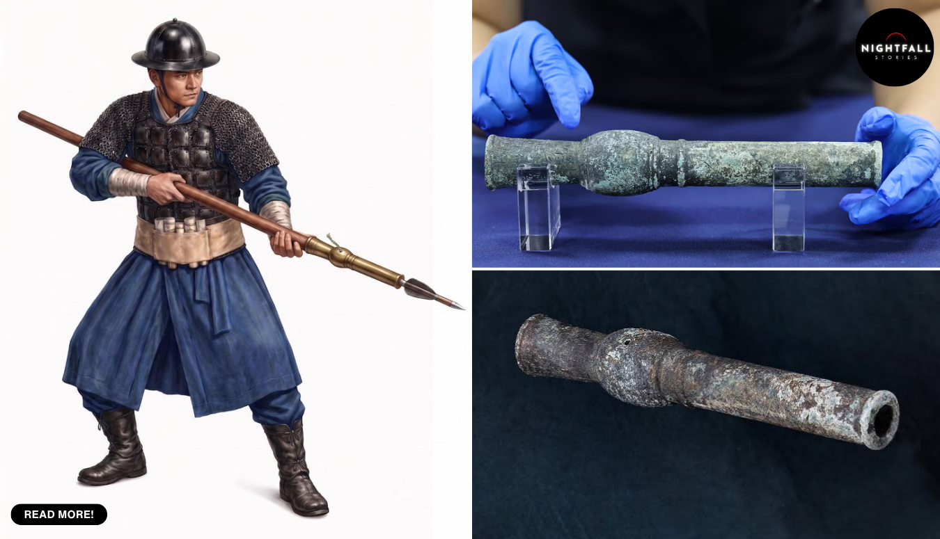
The object came out of the ground about ten centimetres below the surface, on a ridge on Mount Geumseong in Naju, in the southwest of South Korea. A soldier found it. He was not looking for antiquities. He was working an area that had been flagged as an unverified minefield, sweeping it ahead of plans to build a hiking trail, which is exactly the kind of slow, careful, unglamorous job that has to happen before anyone puts a path through ground nobody has cleared.
What he turned up was a bronze tube, under a kilogram and a bit, small enough to hold in two hands. It was a weapon, but not the sort he had been sent to find. It was about six centuries older than that.
The find was in late 2023. The answer took until this September. That gap is the whole story, and it is the part that usually gets flattened when a discovery like this reaches the news, because headlines compress three years of laboratory work into a single morning. What actually happened is that researchers at the Naju National Research Institute of Cultural Heritage spent three years establishing, carefully and with the real possibility of being wrong, that the thing was what it appeared to be. The announcement that it is the oldest gunpowder weapon yet recovered in Korea is the end of that process, not the beginning.
There is a detail in the circumstances worth pausing on, because chance finds are a different problem from excavations. An archaeologist digging a site controls the sequence. Everything comes up in a recorded order, with the soil around it, and the layers themselves carry information about age. A barrel lifted out of a ridge during a safety sweep arrives with almost none of that. It had been sitting about ten centimetres below the surface, shallow enough that frost, roots, rain and foot traffic had all had access to it for centuries, which is also shallow enough that the whole thing could easily have been broken, dragged or thrown away by someone who took it for scrap. Bronze is forgiving in soil in a way iron is not, and that is most of the reason this object exists to be argued about. It also means the researchers had no stratigraphy to lean on. Everything they could learn, they had to learn from the metal and the writing.
The object is called a Hwangja Hwatong, which translates roughly as the yellow character hand cannon. A hwatong is a fire tube, a short bronze barrel that used a gunpowder charge to launch an arrow further and harder than a bow could. This one measures 23.75 centimetres, has a bore of 1.66 centimetres, and weighs 1,032 grams. You could carry it in a coat pocket if coats of the period had pockets.
And cut into it are 28 characters.
That is why this is a story about people rather than about hardware. Most surviving early weapons are anonymous. You date them by shape, by alloy, by where they were dug up and what was dug up alongside them, and you end with a range and a shrug. This one introduces itself. Twenty seven characters are arranged in six columns on the socket, with a single character on the muzzle, and together they say approximately this: in the twelfth month of a Jeongsa year, the Hwangja Hwatong was made, its weight is one geun and 14 nyang, the supervising official was Noksa An Hyu-bo, and the craftsman was Seok.
A name. The man who cast it, recorded on the thing he cast, six hundred years ago.
Seok is the human centre of this, and it is worth sitting with what little we have of him, because it is more than almost anybody at his level of the social order ever gets. He was a foundry worker, a caster of bronze, operating under an official named An Hyu-bo whose title, noksa, places him in the lower working ranks of the state bureaucracy. We do not know Seok’s full name. We do not know where he trained, how old he was, how many of these he made, or whether he was proud of this one. We know he made it in the twelfth month of a particular year, that the state thought it worth recording who he was, and that he hit his weight specification: one geun and 14 nyang, in the units of his day, works out to very close to the 1,032 grams a modern balance reads today. Six centuries later, his number still checks out.
The inscription also sets up the puzzle that the institute is still working on, and the one place where a lot of the coverage has gone slightly too confident. The date is given as a Jeongsa year, which is a position in a sixty year cycle rather than a number on a line. Jeongsa comes round every sixty years. To pin it, you have to bracket it with other evidence, and the research team did that by looking at the span in which a weapon like this could plausibly exist at all: from the mid fourteenth century, when barrels of this general family first appear in the written record, to the late 1440s, when the firearm system of King Sejong’s reign had been fully worked out and standardised. Inside that window, two Jeongsa years fall: 1377 and 1437.
Sixty years apart, and they mean genuinely different things.
If it is 1377, the object sits at the very start of organised state weapons production, in the year a Goryeo military official named Choe Mu-seon is recorded as having set up the first government directorate for gunpowder arms. That would make this not just an early piece but a piece from the founding moment, the output of the first workshop the state ever ran for the purpose.
If it is 1437, it belongs to a completely different situation: a mature administration in the middle of a serious technical overhaul, a few years before the standardisation of new firearm types, with workshops already experienced and record keeping already tight.
The team is unusually plain about not knowing. There is not enough comparable material, they say, to settle it. There is one structural hint that leans earlier. The powder chamber is rounded, and it lacks a feature called the gyeokmok, a wooden plug that appears in later barrels of this family. An absent feature is weaker evidence than a present one, but it is consistent with an object from before that refinement existed, which would favour 1377. The institute’s position is that the question is open and that it will keep working on it.
Getting even that far took the slow part. Authentication of an object like this is largely the business of trying to prove it is a fake and failing. The institute ran metallurgical analysis and imaging, consulted outside experts across eight separate sessions, and examined the inscription, the construction and the alloy against each other. The composition came back as a copper, tin and lead bronze, with the tin content deliberately held under ten percent by weight. That is a real decision rather than an accident of supply. Higher tin gives you a harder, more brittle metal, which is fine for a bell or a mirror and dangerous for a tube that has to contain an explosion directly against a human hand. Keeping tin low trades hardness for ductility, so the barrel flexes rather than shatters. Somebody in that foundry understood that, whether as theory or as the accumulated lesson of barrels that had failed.
The microscopic work was what closed the door on forgery. The metal carries impurities, traces of sulfur, silicon and silver, left by a smelting and refining process consistent with the period and inconsistent with any modern reproduction. A forger can copy a shape and can even copy a script. Getting the dirt right in the metal, at the level of trace elements left by medieval refining, is a different problem. That is the finding that lets the institute say this is genuinely old rather than merely old looking, and it is why the process took years and not weeks.
The superlative being claimed needs to be stated precisely, because the compressed version of it is wrong in a way that matters. This is not the oldest Korean firearm anyone has ever seen or heard of. The claim is narrower and harder: it is the earliest surviving gunpowder weapon recovered in Korea with an establishable production year. The previous holder of that position was a piece known as the Cheonja Chongtong, dated to 1555. Which is where the arithmetic in the headlines comes from, and why there are two numbers rather than one. If the Hwangja Hwatong was cast in 1437, it pushes the earliest dated example back by 118 years. If 1377, by 178. Both figures are circulating, and treating either as the settled answer means picking a side in a question the researchers themselves say is open.
There is a gap this closes, and it is a specific one. The written record in Korea refers to barrel weapons of this family from the middle of the fourteenth century onward. The objects did not match. For a long stretch of that early history there were documents describing a technology and almost nothing you could put on a table, and the earliest surviving pieces with firm dates sat well over a century after the texts begin. That is an uncomfortable place for a field to be, because it leaves the whole first phase of a technology resting on description alone. The Hwangja Hwatong lands inside the gap. Even at the later of its two candidate years it is the first physical object anyone can point to from the period the documents have been describing by themselves.
Cho Mi-soon, who directs the Naju institute, presented the findings, and the Korea Heritage Service made the announcement. The object is now in Seoul, on show at the National Palace Museum of Korea in a special exhibition that opened in late September and runs until 22 November, displayed alongside the analysis that established what it is: the imaging, the metallurgy, the reading of the inscription.
It is worth being careful about how a weapon gets talked about. There is a way of writing this story that turns it into a flag waving exercise about technological precedence, and that reading does not survive contact with the object. A hwatong was a battlefield tool for shooting arrows at people, made in a period when the Korean peninsula and its coasts faced raiding and invasion that killed and displaced a great many of them. The interest here is not that it was powerful. It was small, awkward, and probably frightening to use. The interest is administrative and human. It is a state learning to make a new and unstable technology, and leaving, on the object itself, the name of the man who did the physical work.
That is genuinely unusual, and it reaches past weapons. Inscriptions like this are the thinnest thread connecting named individuals to the actual making of things in a period where the written record overwhelmingly belongs to kings, scholars and generals. The casting artisan of a hand cannon in the fourteenth or fifteenth century is precisely the kind of person who leaves no trace at all. Seok left one, not because anyone thought his life was worth commemorating, but because the state wanted accountability. If a barrel burst, somebody had to be answerable for it. Quality control, six centuries ago, is the reason we have his name.
There is a thought in that about the people in this story generally. A soldier walking a ridge for mines so that other people can walk the same ridge safely. Heritage staff who took three years to say something they could have guessed in an afternoon. A low ranking official whose job was to put his name next to someone else’s work and vouch for it. And a caster who got the weight right to within a few grams of what his inscription promised. None of them were doing anything a chronicle would record.
What happens next is that the dating argument gets fought out properly. The institute needs comparative material, which means other barrels of the same family with firmer dates, or documents that name a Hwangja Hwatong specifically, or another object by the same hand. Any of those could land. Until one does, the object sits in a museum case in Seoul as the oldest Korean gunpowder weapon with a production year that can be established, while the year itself stays an argument between 1377 and 1437, with the researchers who studied it the loudest voices saying they do not yet know.
Which leaves the strangest thing about it. It can tell you who made it, and under whose supervision, and what it weighed, down to the fraction of an old unit. It just cannot tell you when. The one piece of information Seok did not think he needed to spell out, because everybody in the twelfth month of a Jeongsa year knew which Jeongsa year they were living in, is the one that will take the next few years of somebody’s working life to recover.
The plan was boring, and that is the point. Three researchers set up a tripod in front of a weathered limestone wall in Larnaca, on the southern coast of Cyprus, and started a terrestrial laser scanner turning. They were there to record the stonework of a Late Bronze Age temple: how the blocks were cut, how they were set, what the builders had done with stone that had been hauled from a quarry on the far side of the bay. Masonry research. Nobody expected to find a fleet.
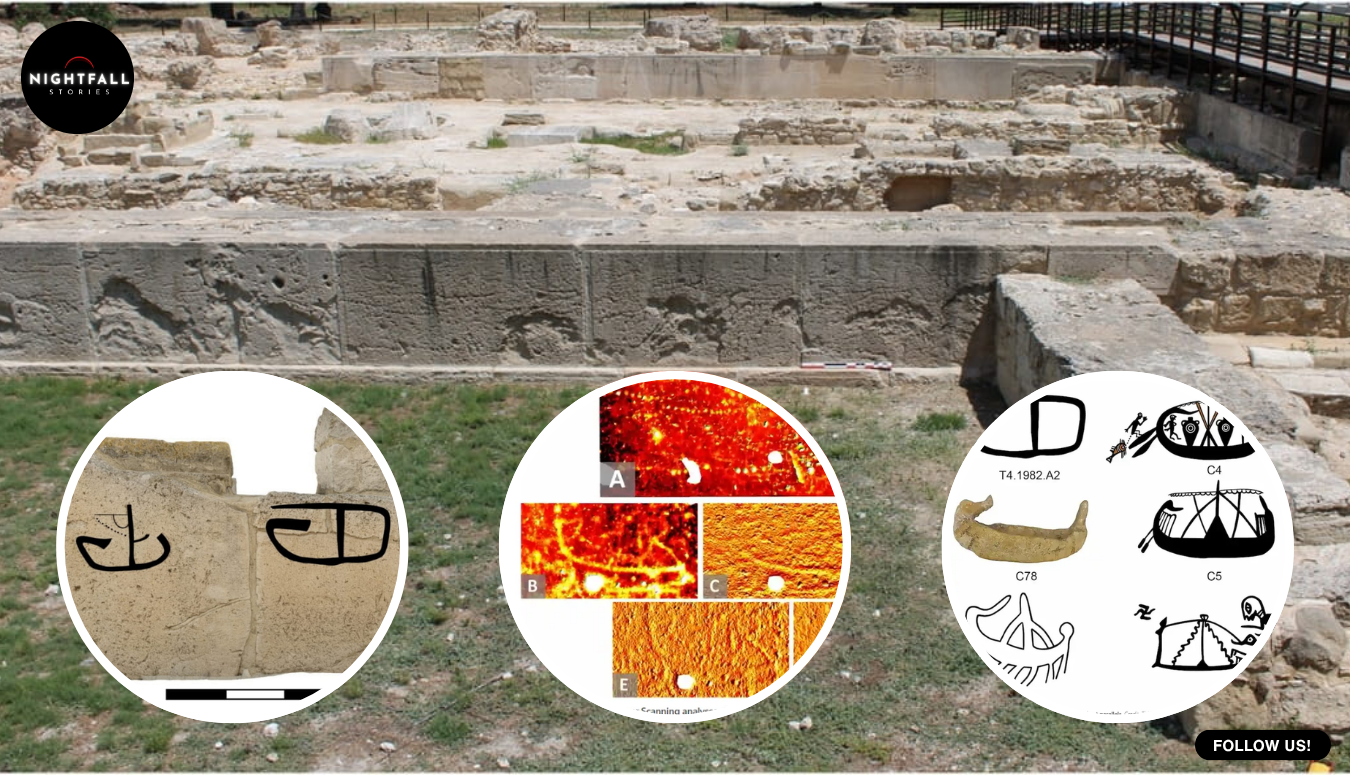
When the point cloud came back and they began measuring how far each mark dipped below the plane of the stone face, ships started appearing. Twenty three of them, cut into blocks that had been excavated, photographed, drawn, published and walked past by visitors for about forty years. The carvings had never been covered up or sealed behind anything. They were simply too shallow and too worn for a human eye to separate from the general damage of three thousand years of salt air. A machine that measures millions of points in three dimensions, without touching the surface at all, could tell the difference between a deliberate incision and a scratch.
That work is now published in the International Journal of Nautical Archaeology, in a thirty four page paper by Graham C. Braun of the University of Cincinnati, Caroline Barnes of the University of British Columbia, and Tzveta V. Manolova, who is based at Ludwig Maximilian University in Munich. Braun and Barnes were the ones recording the architecture. Manolova built the photogrammetric models and the drawings, work connected to a digital documentation project for ancient Mediterranean material. Between them they turned an accident into a catalogue, which is a less glamorous sentence than it sounds and a much more useful one.
To understand why 23 new carvings matters, you need to know what was already there. The site is Kition Kathari, a temple complex under the modern city of Larnaca, excavated across decades under the Cypriot archaeologist Vassos Karageorghis. In the early 1980s a recording campaign documented 19 ship images on the south face of Temple 1, and those drawings were published in the middle of that decade by Lucien Basch and Michal Artzy. For four decades, those 19 ships were the corpus. They were reproduced in survey books, argued over by specialists in ancient seafaring, and treated as a more or less closed set: a group of carvings, probably made at roughly the same time, probably connected to a single moment or a single ritual.
The new work does not overturn that earlier campaign. It explains it. The 1980s team worked with raking light, tracing, photography and extremely good eyes, and they found everything that method could find. What they could not do was quantify depth. A carved line on Koronia limestone that has lost a millimetre or two to erosion stops reading as a line and starts reading as noise. The laser scanner does not care how a mark looks. It records where the surface is, and the researchers then asked two questions of every candidate: how far below the surrounding plane does this sit, and at what angle does its edge cut in. Tool marks cut at angles that weathering does not produce. Run that test across an entire wall and the invisible becomes measurable.
It is worth picturing the actual labour, because it is not glamorous and it is where the discovery came from. Terrestrial laser scanning means a tripod, a levelled instrument, and a decision at every position about what the machine can and cannot see from there. A wall built of large upright slabs has recesses, overhangs and shadow, so one scan is never enough. You move the tripod, you scan again, you leave targets in the scene so the separate clouds can be stitched into one model afterwards, and you do that around a structure in coastal heat until the coverage has no holes in it. Then the real work starts, which happens at a desk, months later, as you query a surface made of millions of points for marks that your eyes already told you were not there. The 23 ships were not spotted. They were computed.
The team was honest about the limits of that, which is one of the better things about the paper. They did not present 23 equally certain discoveries. They sorted them by confidence: nine they consider high confidence ships, six medium, and eight low. The low confidence group is exactly what it sounds like, marks that behave like carving and may well be carving, offered for other people to argue with rather than banked as fact. Added to the earlier 19, plus two carvings on an altar in a separate building at the site, the documented total at Kition now stands at 43 ship images, 41 of them on Temple 1 and two on the Temple 4 altar.
That is a doubling of the corpus, and it would be interesting on its own. But the finding that actually changes something is not the count. It is the spread.
The researchers sorted the vessels into six groups by hull shape, and the groups are not variations on one theme. At the simplest end there are ships reduced almost to a single curved line, the kind of mark anyone could make in a few minutes with a hard point. At the other end there are galleys with a triangular prow, a curved bow device that looks like a horn, and a tall sweeping stern. In between sit flat, symmetrical hulls with tall vertical posts at each end, a form that matches a known type of Levantine merchant ship, and hybrid galleys with asymmetrical hulls and curved ends that do not fit neatly into either the Cypriot or the Levantine tradition. The team found parallels for individual hulls in material from Enkomi and Lapithos on Cyprus, from Akko and the Carmel coast, and from Tell Tweini on the Syrian coast.
Those traditions did not all exist at once. Some of these hull forms belong to the Late Bronze Age, when Kition was a working harbour town in a Mediterranean tied together by copper, tin, oil and grain. Others belong to the Early Iron Age, after that system came apart. Read the wall as a single composition and it makes no sense. Read it as a wall that people kept coming back to, for something in the order of three centuries, and it does.
That is the argument, and it has teeth, because the period it spans is one that gets written as an ending. Around 1190 BCE, give or take, the eastern Mediterranean went through the collapse that ended the Late Bronze Age palace states. Cities burned, writing systems fell out of use, trade routes that had run for centuries stopped running. Kition itself was founded around 1300 BCE and went through a major rebuilding phase at roughly the moment of the collapse, which is when the monumental south wall of Temple 1 took the form the scanner recorded. If the ship carvings run from that rebuild forward into the Cypro Geometric period of the Iron Age, then people at this one building were still thinking about ships, still looking at ships, and still cutting ships into a sacred wall straight through the rupture.
The carvers also seem to have been looking at each other’s work. One of the more quietly striking observations in the paper is that the carvings share conventions across the whole span, most obviously a habit of rendering lines as rows of dots. That shared habit is partly why the wall looks like one composition at first glance. It may not be a single hand or a single generation. It may be hundreds of years of people copying the local way of doing it, the way graffiti on any long lived surface develops a house style.
There is a detail about the stone that gives this more weight. The south façade of Temple 1 is built of Koronia limestone orthostats, large upright slabs, the biggest of them between 2.4 and 3.1 metres long and about 1.4 metres high. That stone was not local. It was quarried roughly twenty kilometres away, on the other side of Larnaca Bay, and moved. Whoever built this wall chose expensive, imported, visibly special material for the most monumental structure at the site. People then cut ships into it. The researchers take that as evidence the carving was not casual vandalism done in the dark. You do not repeatedly mark the best stone on the most important building unless the marking means something and is tolerated.
What it meant is the part nobody can scan for. The ships on Temple 1 cluster at around eye level along the south wall, which tells you they were made by adults standing in front of it, not by anyone on scaffolding or stretching, and that they were made to be seen at the height a person naturally looks. The conclusion the team lands on is deliberately modest and more interesting for it. Ships were not an exotic subject for these people. They were ordinary furniture of life, close enough to hand that marking one on a temple wall was a normal thing to do, repeated across generations. There is a version of this story where the carvings become sacred maritime offerings in a grand cult of the sea. The paper does not tell that story, and the evidence does not require it.
It is worth being clear about what is still soft here, because the strongest part of this research is its willingness to show its own seams. Dating graffiti by style is an argument, not a measurement. There is no carbon in an incision. The three century span rests on matching hull forms to vessel types known from dated material elsewhere, and those matches are judgements made by specialists who can be wrong, or who can be right about one hull and wrong about the next. A yellow sandstone block in the wall, repaired at a later phase, gives one useful anchor, but one anchor is not a chronology. The eight low confidence marks may turn out to be erosion. None of that undoes the finding. It just means the finding is a case, published with its uncertainties labelled, rather than a verdict.
What the finding changes most directly is an interpretation, and that is a quieter kind of correction than a new object. For forty years the reasonable reading of the Kition ships was that they were a group: a set of images of similar character on one wall, plausibly made in a single phase, plausibly connected to one event or one act of devotion. That reading was reasonable because the visible sample supported it. Double the sample and the picture breaks apart into something less tidy and more alive. Not one moment, but a long habit. Not a composition, but an accumulation. Anyone who has written about Late Bronze Age Cyprus using those 19 ships as a single dated data point now has to decide which of the six groups they were actually talking about.
It also puts a small piece of evidence on an argument that runs well beyond one wall. The end of the Late Bronze Age in this region is usually told as a severing: the networks that moved copper and tin and oil across the sea stopped, and what followed was a different and poorer world. Specialists have been chipping away at the severity of that story for years, pointing to places where life and trade carried on at a lower volume rather than stopping. A wall where people kept cutting ships through the whole transition, in forms that change as shipbuilding changes, is not proof of continuous seafaring. It is one more reason to doubt that the lights all went out at once, and it comes from a source that is hard to argue with, because nobody carves a kind of ship they have never seen.
There is also something in this story for every site that has already been dug. Kition was not a lost ruin. It was excavated over decades, published repeatedly, and is open to visitors. The south wall of Temple 1 had been studied by serious people with serious methods, and everything they said about it was true. There was just more on the stone than their instruments could reach. Somewhere between a quarter and a half of archaeology’s working material is sitting in exactly that condition right now: recorded, catalogued, considered finished, and legible to a machine that did not exist when the trench was backfilled. The team at Kition was not even looking for carvings. They were looking at how blocks were cut.
The carvings themselves have now been published, numbered, drawn and grouped, which is the thing that actually protects them. Koronia limestone on a coastal site is losing a little of itself every year to salt and wind, and the marks that were too faint for the 1980s campaign to see are the ones closest to vanishing. A point cloud is a copy that does not erode. Even if the stone keeps going, the geometry of those 23 ships is now on record at a resolution that lets someone in fifty years re measure them and tell this team it got group four wrong.
That is a decent place for a discovery to end up: not as a headline about hidden treasure, but as 43 catalogued ships on a wall, sorted by confidence, with a dating argument offered up for attack, and with a human conclusion that is almost ordinary. For centuries, people walked up to the best stone on the most important building in their town and drew the boats they knew. Different boats, different centuries, same wall, same height, same habit of making the lines out of dots. A laser scanner pointed at the stonework found them because it was measuring something else entirely.
Earlier this year, in a twelfth century church in the East Yorkshire market town of Beverley, a team began taking a pipe organ apart. It was a four manual instrument with thousands of pipes, the largest of them around 40 feet long, and it filled the north transept wall from floor to roof. Nobody was buying it. The church was giving it away, free, to a parish in Oslo, because the alternative on the table was not restoration. It was scrap.
Then the last of the pipes came out, and the wall behind them was visible for the first time in well over a hundred years. There were medieval stone carvings on it. There were windows that had been blocked by pipework since before anyone now living was born, which meant daylight came back into a corner of the building that had not had any. There were memorial stones to people nobody had been able to read about for generations. Above, in the newly opened sightline, were roof bosses from the medieval and Tudor periods, part of a set of around 700 painted carvings that runs across the church’s ceilings. And there were stone gargoyles, including a pair flanking a doorway, that had been sitting in the dark behind an organ.
The first thing to get straight about this story is the clock, because almost every retelling has it wrong. This was not a church that suddenly lost its organ. The organ had already stopped being the church’s instrument two years earlier. A Viscount Regent 361 digital organ was installed at St Mary’s on 5 February 2024 and has been doing the work at services ever since. By the time the pipes came down, they had been silent for a long time. The event of this year was not a loss. It was a removal, and a discovery.
The reason the instrument lost its job is unglamorous and very common. It had chronic electrical faults in the run between its remote console and the pipes themselves. It would simply stop mid service. The temporary fix, by the account of the firm that replaced it, amounted to switching the thing off and on again. An organist can live with a reluctant stop or a wheezing rank. An organist cannot live with an instrument that goes dead during a hymn, in front of a congregation, with no warning and no way of knowing whether it will come back.
St Mary’s organist, Michael Ellerington, played it through that period, which is its own kind of endurance. The vicar, the Reverend Becky Lumley, was the one who had to decide what happened next, and the numbers she was handed did not leave much room.
Harrison and Harrison, one of the most respected organ builders in England, surveyed it. Their conclusion was that repairing or rebuilding it would cost somewhere close to 1.5 million pounds, roughly 1.9 million US dollars, and that little of the existing pipework merited reuse. The diocesan organ advisers agreed with that assessment. That second finding is the one that quietly decides everything. If the pipework had been judged worth saving, a long campaign to raise the money would have been the obvious route, and churches do run those campaigns and sometimes win them. If the pipework is not worth saving, you are not fundraising to rescue a treasure. You are fundraising to build a new instrument inside an old case.
And the church did not have the money, or anything like it. St Mary’s was carrying an urgent repair backlog above 4 million pounds, around 5 million US dollars, on the building itself. Included in that backlog was the roof of the north transept, which is to say the roof directly above the organ. There was a hole over the instrument. Fixing the roof meant getting the organ out of the way regardless of what anyone wanted to do with it.
That is the shape of the decision, and it is worth sitting with before anybody reaches for an opinion about heritage. A Grade I listed building founded in the first half of the twelfth century, with 900 years of fabric to keep standing, had a four million pound bill, a leaking transept roof, and an organ that had been declared not worth the one and a half million it would take to make it work.
The instrument that left Beverley was also not quite the thing it has been described as. One widely shared account called it a hundred year old English organ. The real lineage is messier and more interesting. The church bought an organ in 1792, built by Donaldson of York and set in the rood loft, paid for with 311 pounds raised by voluntary subscription. In 1869 the Hull firm of Forster and Andrews built a new instrument, behind a richly carved oak screen with decorated front pipes. The same firm came back in 1889 to add a detached console and pneumatic action. Then in 1908 Lewis and Co of London rebuilt it completely and discarded the oak case. Between 1954 and 1957 Hall and Broadfield replaced the pneumatic action with an electromagnetic one and converted it from three manuals to four, and the rebuilt organ was dedicated in 1957.
So what was dismantled this year was a Forster and Andrews foundation of 1869, rebuilt wholesale by a London firm in 1908, rewired and enlarged in the 1950s, with its original case long gone. Describing it as a Forster and Andrews organ is a reasonable shorthand for where it started. Describing it as a hundred year old instrument is not really accurate in either direction. It is the sort of layered object most large parish organs actually are, which is part of why the question of what to preserve is harder than it looks from outside.
There is a local poignancy in that 1869 date that is easy to miss. Forster and Andrews were a Hull firm, which is about ten miles from Beverley, and in the second half of the nineteenth century they were one of the busiest organ builders in the country, turning out instruments for churches and chapels across Britain and well beyond it. An organ built by them for a church in their own county was a piece of regional industry as much as a piece of church furniture, made by people who could have walked to the building. What the 1908 rebuild and the 1950s rewiring did, between them, was gradually replace that local object with a national one, and then with a modern one, until the only Hull-made thing left in the transept was the layout. That is not an argument against any of those rebuilds, each of which was done to keep the instrument working. It is just worth knowing when you hear the organ described as theirs.
The other end of the arrangement is a man called Marius Skjolaas, director of music at Trinity Church in Oslo, whose building is in the middle of a major renovation of its own. Oslo wanted pipes. Beverley had pipes it could not afford to keep and could not leave in place. The plan, as reported, is for the Beverley instrument to be combined with recycled parts from decommissioned Norwegian organs and installed in the rebuilt church, which will hold something like 1,200 to 1,300 people and is being set up to work as a concert venue as well as a parish church.
Here is where honesty about sourcing matters. Essentially all of this rests on one piece of original reporting, a BBC item by Sally Fairfax and Paul Johnson. Everything else in circulation is derived from it. The independent corroboration that exists is thin but real: the organ builder’s own published case study on the digital replacement, which supplies the survey figure, the backlog figure, the names and the February 2024 installation date; a local Hull aggregation of the BBC piece; a short, pointed item on a classical music blog; the church’s own description of its building; and, separately and more usefully, Norwegian coverage of the Oslo renovation. For the discovery behind the organ, there is one account. Anyone telling you this story with more confidence than that is borrowing it.
The blog item is also where the only real dispute lives. Norman Lebrecht, writing as the pipes came down, told his readers the organ’s space was to be replaced by a coffee shop, and called the whole thing a wretched example of the Church of England neglecting its heritage. The coffee shop claim does not match what the church says. St Mary’s own stated intention for the cleared area is to leave it open and use it to improve access for visitors with mobility difficulties, a new route into the building for people who could not easily get in before. Those are not the same plan, and one of them comes from the parish and the other does not. A Beverley resident turned up in the comments under the blog item to point out that the organ had been out of use for two years and was in poor condition, which is exactly what the documentary record shows.
The heritage argument underneath the rhetoric is not silly, though. English parish churches are shedding large organs, and when one goes it rarely comes back, because the skills and the money that built them are both scarcer than they were. A report circulated this year warned that church organs across Britain could largely fall silent within fifty years. That is a real trend and Beverley is a data point in it.
The counter-argument is simply the one the church was actually facing. The choice was not between a restored Victorian organ and a coffee machine. It was between an unplayable instrument blocking a damaged roof, and a working digital organ plus an open wall, with the pipes going somewhere they would be used rather than into a skip. Given a survey saying the pipework was not worth reusing and a four million pound hole in the budget, giving the thing away to someone who wanted it is not neglect. It is the least wasteful option available.
Which leaves the question of whether the Oslo end has actually landed, and the answer, at the time of writing, is not yet.
Trinity Church’s own renovation page is specific about a great deal: a new 650 square metre extension with offices and a parish hall, pews replaced with chairs to take capacity to around 1,200, a new wheelchair and lift entrance, new floors, public lavatories in the old sacristy. It says a completely new organ will go into the right side of the front gallery, built in English cathedral style, with pipework consisting mainly of recycled pipes from Norwegian organs. It names no English church at all. Beverley does not appear on it.
Norwegian music press in September put the sequence differently and more usefully: a pre-opening of the church’s new concert stage in November, with the full reopening after complete renovation pushed out to late next year, and two instruments in the room, Norway’s largest recycled organ assembled from decommissioned Norwegian parts and, alongside it, an Anglican instrument brought from St Mary’s Church in Beverley. So the pipes are acknowledged, by somebody, in Norway. They are also not playing, and will not be for a good while, and the parish’s own account still foregrounds the Norwegian pipework.
That is the honest state of the emigration, and it is why the ending of this story is not in Oslo. Crates of pipework waiting on a renovation that has already slipped twice is not an ending. It is a hope with a schedule attached.
The ending is the wall in Beverley.
Go into St Mary’s now and the north transept is open. The organ is gone and nothing is going in its place. The windows it had been covering are letting light into the transept again, which is the single change people notice first and the one no amount of money could have bought while the instrument stood there. The memorial stones are readable. The gargoyles that spent a century facing the back of a soundboard are facing a room again. Above, in a church already known for its painted roof carvings, there are bosses in the newly cleared sightline that were effectively private for over a hundred years. Somewhere in that same building is the white rabbit in a travelling cloak that visitors are told may have given Lewis Carroll his White Rabbit, which gives you a fair sense of what else the place has been quietly holding.
And the floor where a four manual organ used to stand is going to stay empty on purpose, so that someone in a wheelchair can get into a twelfth century church.
There is a tidy way to say this that would be too tidy, so here is the plain version instead. The organ at St Mary’s did not get a restoration, because the people who would have had to do the restoring said it did not warrant one. It did not get a glorious last recital, because it had already stopped working. What it got was a second life abroad that has not started yet, and one final act of use at home that nobody planned and nobody could have arranged: by leaving, it gave the church back a wall, a set of windows, and a way in.
On Anzac Day this year, a little before the service began in Wellington, a twelve and a half tonne bronze bell called Rangimarie was tolled four times from a tower above the city, once for the Army, once for the Navy, once for the Air Force and once for the Merchant Navy. Then 74 bells began to sound over Pukeahu National War Memorial Park for the first time in years, after roughly six million US dollars of earthquake strengthening and a silence that had swallowed most of the last decade and a half.
The man at the keyboard had flown in from Canberra. He was 25 years into a career on an instrument he first touched at fourteen, and he had never played an Anzac Day service in New Zealand before. He was there because the job that should have put a New Zealander in that seat no longer existed. About ten weeks before the bells came back, the Ministry for Culture and Heritage confirmed that its change process had resulted in the disestablishment of the role of National Carillonist, a permanent public position that had existed since the tower opened in 1932 and had been held, in all that time, by exactly four people.
To understand why that is strange rather than merely bureaucratic, you have to understand what a carillon actually is, because it is not a set of church bells and it is not a clock chime. It is a musical instrument the size of a building, and it has to be played by hand.
The Pukeahu carillon hangs inside a campanile about 51 metres high, a tall pale tower that has been one of Wellington’s landmarks for most of a century. Inside it are 74 fixed bells, cast bronze, weighing something in the order of 70 tonnes in total, which makes the instrument the third largest carillon in the world by weight. The bells do not swing. Each one has a clapper connected by a stainless steel cord running down through the frame to a wooden baton keyboard in a small cabin partway up the tower. The player sits at that keyboard and strikes the batons with closed fists, and works a set of pedals with both feet for the heaviest bells. The sound does not come out of a speaker. It comes out of the tower and travels across a city.
The tower is not a decoration on top of something else. It is the memorial. Beneath and beside it sit the Hall of Memories and the wider Pukeahu park, a place built so that a country could put its war dead somewhere and go and stand there. That matters to the engineering argument, because a carillon is a memorial that works by being audible. A silent one is a very tall headstone. Every mechanical fact about the thing therefore carries freight that a concert instrument would not: the cords are load-bearing in two senses, and a broken connection is not only a dead note.
It is worth being precise about one detail that gets repeated wrongly, because it is the sort of thing that sounds better than the truth and does not need to be. Rangimarie, the great bass bell, is not the third heaviest carillon bell on earth. It is the heaviest bell in the southern hemisphere, which is a remarkable thing on its own. It is the carillon as a whole, all 74 bells together, that comes third in the world. That bell was one of four large bass bells added in 1995, more than sixty years after the instrument first sounded.
The tower opened on Anzac Day in 1932 with 49 bells, cast by Gillett and Johnston at Croydon in England and shipped out the year before, weighing a little over 30 tonnes between them. The first national carillonist was Gladys Watkins, appointed to the role in 1932, which is its own small piece of history. The instrument was substantially rebuilt and enlarged from 1984 onward, with 21 smaller treble bells added, then the four bass bells in the mid nineties. By then its player was Timothy Hurd, who holds the Queen’s Service Medal and who occupied the post for around four decades, climbing the tower several times a week to play it.
That is the part of this story that has no first person account anywhere that can be reached. Hurd has not, in any coverage that is publicly available, described in his own words what it was like to spend forty years as the only person in the country whose job was to play a war memorial, or what it was like to lose that job in the same season the memorial came back to life. It would be easy to write feelings into that silence. It would also be made up. What can be said is what the ministry itself said, and what the ministry itself did, and those two things are not perfectly aligned.
Here is the documented sequence. In March 2012, engineers identified seismic vulnerabilities and the tower went into strengthening work. Refurbishment ran to late 2013, but the carillon did not reopen until the end of May 2018, after a job that reportedly involved taking some 15,000 individual pieces apart and putting them back. It played for about twenty months. In February 2020 it closed again, after an engineering report found the structure meeting only around 15 percent of the national building standard for earthquakes. A full seismic assessment completed later that year pointed at the bell frames as the weakest element in the whole thing. Along the way the tower’s cladding came under separate scrutiny as well.
So the universal framing this year, that the bells rang for the first time in fourteen years, needs a small correction. They were silent from 2012 to 2018, they sounded for less than two years, and then they were silent again from 2020 until this past Anzac Day. The public broadcaster that has followed the tower’s engineering problems most closely was careful about this, writing that the bells had been silent for most of the last fourteen years rather than all of them, and an earlier piece put it as seven of the previous ten years. That is the accurate version. It is also, if anything, a worse story than the simple one, because it means the instrument was fixed once already and then found to be unsafe again.
The strengthening that finally brought it back cost 10.1 million New Zealand dollars from 2020 onward, roughly six million US dollars. For a country that had lived through the Christchurch earthquakes, a 70 tonne array of bronze suspended 50 metres above a national memorial was not an abstract risk, and nobody seriously argues the work should not have been done.
What is argued is the arithmetic that came next. An internal ministry report written in July last year recorded that the decision had been made to disestablish the carillonist, with the change deferred until the end of April 2026. That is the week the tower was due to reopen. When the decision became public in August last year, the framing in the national press was blunt: the government had spent ten million dollars fixing the bells and was removing the one person who could play them.
In February this year the ministry set out its position in writing. Its change process had resulted in the disestablishment of the National Carillonist role. It said it was exploring a range of options, including contracting carillonists when required, and that this would cost it less than retaining a fulltime carillonist position. It said it was working with the Carillon Society of Australia to make sure a trained player would be available for Anzac Day. And in the same statement it said that Timothy Hurd had since retired, and acknowledged his long contribution to the carillon and to national commemorations.
Those last two sentences sit together uneasily, and it is worth leaving them uneasy rather than tidying them up. One account has the role abolished in a restructure. Another has its holder retiring. Later coverage quoted the Secretary for Culture and Heritage saying that once Hurd had made the decision to retire, the ministry worked closely with the Carillon Society of Australia. Both things can be literally true at once, and the honest description is the narrow one: the ministry ran a change process, the outcome of that process was that the permanent position ceased to exist, and the ministry says the person who held it retired. He was not, on any available account, dismissed. Nor is this a simple retirement, because the post itself did not survive him. It is a job that ended at the same time as a career, and the ministry’s stated reason for the first of those is cost.
There is a narrow version of that reasoning that is hard to dispute. A fulltime salary for a player whose instrument is closed for six years running is money spent on nothing, and the ministry had just absorbed a seven-figure bill it did not choose. Contracting a specialist for the handful of days a year the bells are needed is exactly what any organisation would do with a rarely used skill. The objection is not that the sum is wrong. It is that the skill is not rare because demand is low; it is rare because supply takes a lifetime to build, and the fulltime post was the thing building it. Abolish the post and you have saved the salary and quietly outsourced the pipeline too.
Which brings us to the Australian in the cabin. Peter Bray learned the carillon at fourteen and has played something like 70 of the roughly 700 carillons in the world, a reasonable estimate of how small this profession is. He came from Canberra, home to Australia’s own National Carillon, to play Wellington’s.
The preparation was tighter than anyone would have liked. Days before the service, around ten of the 74 bells were still being connected to their playing cords, which is to say the instrument was not fully assembled the week it was due to be heard by a nation. It came together. Bray played six pieces. Both published programmes agree on the waiata Pokarekare Ana and on a work by the Estonian composer Arvo Part; beyond that the lists differ, one naming Karl Jenkins and another naming Finzi, so the full running order is not something to state with confidence. Rangimarie was tolled its four times. People stood in a park built for exactly this and listened to bells they had not heard in six years.
And then the visiting player went home, and the keyboard in the tower had nobody whose job it was to sit at it.
That is the question the story actually leaves behind, and it is not a question about one man’s exit. A carillon is a slow instrument to learn. It is not transferable from a piano in an afternoon; the touch is different, the sound arrives late, the feedback comes off a tower rather than out of a box, and there are only a few hundred of these things on the planet to practise on. Timothy Hurd was in the post for around forty years because that is roughly the timescale on which carillonists are made. The ministry has talked about monthly recitals and about discussions with Victoria University’s music school on training a resident player, which is a genuine route and not a cynical one. But training a carillonist requires access to a carillon and someone who already knows how to play it, and New Zealand has one of the former and, in an official capacity, none of the latter.
There is a version of this that ends well. The tower is strengthened and open. A university with a serious music school sits a short walk from it. Carillon societies across the world are small enough that people share students and share instruments, and the Australians have already proved willing to fly. If a New Zealander in their twenties starts on those batons this year, the post that was abolished for costing too much could be replaced by something better, which is a player who has decades ahead rather than behind.
There is also a version where the bells become an occasional event, hired in for the days that matter, and the thing that made Pukeahu unusual quietly stops. The carillon was not built to be switched on twice a year. It was built in 1932 as a memorial you could hear, played several times a week by someone who lived in the same city as it.
The bells opened on Anzac Day, 1932. They came back on Anzac Day, 2026, after six million dollars and a decade and a half of mostly silence, and they sounded, by every account, magnificent. Ninety four years, four national carillonists, and on the morning the instrument returned, the title had already been retired along with the man who held it. Somebody still has to climb the tower.