Blog

  • A cellist injured one finger on his left hand. What he had to give up before he played again is the part nobody warns you about

    A cellist injured one finger on his left hand. What he had to give up before he played again is the part nobody warns you about

    The first cancellation looked routine. A young British cellist pulled out of a world premiere with a major American orchestra, a substitute was announced, and the notice said he had injured a finger on his left hand and had been advised by a consultant to stop playing while it healed. Nothing in that wording suggests a crisis. Fingers heal.

    Then the next set of concerts went. Then the ones after those. Then an entire early-year run across two continents, city after city. Then, in the spring, something that is not a concert so much as a career marker: a spotlight residency with one of the most prominent orchestras in the world, cancelled outright rather than rescheduled.

    Sheku Kanneh-Mason did not play a public concert for the better part of eight months. He came back on the last night of July, at the other end of the planet from home, in the Concert Hall of the Sydney Opera House, and the piece he chose to walk out with was the single most exposed and least forgiving thing in his repertoire.

    To understand why this took so long, you have to understand what the left hand of a cellist is actually doing, because most people picture the wrong injury.

    The right arm draws the bow. That is where sound and volume and phrasing live, and it is largely a matter of large-muscle control. The left hand does something else entirely. It sits on the fingerboard and it is responsible for every pitch in the instrument. A cello has no frets. There is nothing to tell a finger where a note is. The player finds each pitch by pressing the string down onto the fingerboard at a position they have memorised through years of repetition so precise that a couple of millimetres is the difference between in tune and audibly wrong. On the lower strings, where the string is longest and thickest, that press requires real force, applied through the fingertip, repeatedly, for two hours at a stretch.

    The same hand also produces vibrato, which is the small oscillation that gives a long note its warmth and its living quality. Vibrato is generated by rocking the fingertip on the string while it is still bearing that load. And in the space between two notes, the whole hand has to shift position along the neck and land, silently and exactly, somewhere it cannot see.

    So a single finger on the left hand is not one component among many. It is one of four instruments of measurement, under constant pressure, doing fine motor work at high speed at the limit of what the human hand is built for. You cannot play around it. You cannot compensate with the others without changing the fingering of everything you know, which for a concerto learned over a decade means unlearning it. And crucially, you cannot rest it while keeping fit, the way a pianist with a sore wrist might do limited work, because the load is inherent to producing any note at all.

    That is why the advice was to stop. Not reduce. Stop.

    The other thing worth understanding is what happens to a professional instrumentalist’s calendar when they stop. Concert dates are set one to three years ahead. Kanneh-Mason had a season built, which meant a specific list of orchestras, halls, conductors and pieces on specific nights, most of them contracted, many of them sold. Every one of those dates had to be individually handed back.

    And here is the part of this story that is quietly brutal. He did it himself, in public, each time.

    There is a sequence of announcements running from late in one year through the winter and spring of the next, and each one is a fresh admission that the previous estimate had been wrong. First the remaining dates of that year, with a note that he was looking forward to returning to the platform in the new year. Then, weeks later, the new year’s January dates: a family concert in his home city with his siblings, then Detroit, Ottawa, Florida, Seattle. Then, as winter turned, another block: engagements in Turin, Amsterdam, Boston, Cleveland, Ann Arbor, Athens and London’s Wigmore Hall. And with that one, an acknowledgement that the finger was healing more slowly than expected and that he would not be playing for some months yet.

    Read those in order and what you are watching is not one injury announcement. It is a person being made to say, repeatedly, over months, that the thing they hoped had happened had not happened. Anyone who has had a recovery drag past its predicted end knows how that erodes you, and most people get to do it privately, to a handful of colleagues. His version came with press coverage each time and other people’s names printed underneath as replacements.

    The loss inside that list that is hardest to replace is the New York Philharmonic engagement. He and his sister Isata, a pianist, were to have appeared in the orchestra’s artist spotlight strand, which is a designated slot that an institution gives to a musician it has decided to present as significant. It is not a booking you pick up again when convenient. It occupies a season, a budget and a curatorial decision, and the reporting indicates it was not rescheduled. That one is simply gone.

    There is also a version of the cost that nobody publishes. An orchestral soloist is paid per performance. Cancelled dates generally pay nothing, and a musician who is medically unable to play for the better part of a year is not covered by the kind of arrangement salaried employees have. A player at his level has a team, an instrument to insure and maintain, and fixed costs that do not pause. He is one of the best-known classical musicians of his generation, with recordings behind him, and that matters at the margins. But the structure of the job is that the money arrives when you walk on stage.

    Then there is the isolation, which is the thing colleagues in this field talk about most when injury comes up.

    The daily practice of an instrumentalist is not preparation for their life. It is their life. Four, five, six hours a day, from childhood, every day, including holidays, including the day after a concert. That routine is the architecture a player’s whole sense of themselves is built on. Remove it and there is no obvious substitute activity, because the one thing that reliably makes a musician feel like themselves is the one thing they have been told not to do. Kanneh-Mason started the cello at six. He passed the highest grade of the British examination system at nine with the top marks in the country. He has not had an extended period without the instrument in his hands since he was a small child.

    And a musician in that position is also, unavoidably, doing arithmetic about whether the hand comes all the way back. Nobody says that part out loud early. Fine motor function at professional standard is a narrow target, and there is a great deal of distance between a finger that works normally and a finger that can find a pitch to within a millimetre under load for two hours. He has never spoken publicly about that fear, and it would be wrong to put it in his mouth. But it is the question hanging over every one of those cancellations, and everyone in the profession reading them knew it.

    There is one more practical dimension that outsiders rarely think about, which is the instrument. He plays a cello built by Matteo Goffriller in 1700, an instrument from the Venetian school, older than almost everything played on it. Instruments like that are not inert objects waiting in a case. They shift with humidity and temperature, the setup drifts, and the relationship between a player and a particular cello is maintained by playing it constantly. Months of silence do not damage a cello, but they do mean that when a player comes back, the instrument has to be relearned slightly at the same moment the hand is being relearned. Two variables, both uncertain, at once.

    So the return is worth looking at closely, because he made two choices about it that are more revealing than anything he said.

    The first was the location. He came back not in London, not in Nottingham where he grew up, not in any hall where the audience would be made up of people who know him. He came back in Sydney, on the far side of the world, making his debut with the orchestra there, on a programme conducted by Simone Young, with Strauss’s enormous Alpine Symphony filling the second half. You can read that as scheduling, and partly it will have been. But the practical effect of returning fifteen thousand kilometres from home is that if it goes badly, it goes badly a very long way away, in front of people who have no prior expectation of you. It is, in one sense, the most protected place to take the largest possible risk.

    The second choice is the repertoire, and it is the one a musician would raise an eyebrow at.

    He played the Elgar Cello Concerto. That is the piece he is most closely identified with. His recording of it, with the London Symphony Orchestra under Simon Rattle, reached the top ten of the British album chart, which no cellist had managed before. It is the work audiences turn up expecting from him.

    It is also, of everything he could have programmed, close to the worst possible choice for a hand that has just spent months out of use. The Elgar opens with the soloist essentially alone, exposed, with nowhere to hide, and the whole concerto lives on sustained lyrical lines that demand continuous controlled vibrato and constant position changes across the full range of the instrument. It has no bravura passagework to hide behind. Its difficulty is not speed, it is that everything must be perfectly in tune and perfectly sustained while the orchestra sits quiet enough for the audience to hear any imperfection. A player wanting to protect themselves on a first night back would pick something with more orchestral cover and more technical noise to disappear into.

    He picked the piece that would expose the finger completely, and he picked the piece he had already set the public standard on, meaning he would be compared directly to his own recording.

    What that says about the state of the hand, honestly, is more than any statement did. You do not choose the Elgar as a comeback vehicle unless you have been in a practice room recently and know what the hand can do.

    He played it. The concert went ahead, and the series with the Sydney Symphony continued into the following night. Coverage of the return in the classical press was straightforwardly relieved, and put his absence at nine months, which is roughly right and slightly generous; from the first cancelled performance in late November to the end of July is a little over eight.

    What is not documented, and what the article you are reading is not going to invent, is a recovery. Kanneh-Mason has not publicly said that the finger is fully healed. He has not described the injury beyond the original statement, no source names which finger it was, and nobody has published a medical account of it, which is entirely his business. What exists on the record is a hand that was injured, a consultant who said stop, a run of months in which the estimates kept being revised, and then a specific night in a specific hall in which he walked out and played the hardest thing he owns.

    His published schedule afterwards runs on across Europe and North America, which is the most meaningful signal available, because nobody books a season they do not expect to play.

    It is tempting to make this a story about courage, and that is not quite what it is. It is a story about a person whose entire working identity depends on the reliable behaviour of a few square millimetres of one fingertip, who had that taken away without a clear end date, who had to announce the loss of his own year in instalments while other musicians stepped into his concerts, and who then chose to come back in the most exposed way available to him rather than the safest.

    He walked out in Sydney and played the Elgar. The finger held.

  • For nine days almost nobody bought a ticket. Then strangers started driving for hours to laugh at it

    For nine days almost nobody bought a ticket. Then strangers started driving for hours to laugh at it

    For nine days, the film played to almost nobody. It had opened across 245 screens in China, a real release in real cinemas, and in that opening stretch it took the equivalent of roughly a thousand dollars. The ticketing data puts the audience at fewer than three hundred people nationally. On one of those days it made about $137. By the middle of the second week, the number of venues still bothering to run it had collapsed to four.

    Then, over the following weeks, that same film took somewhere around nine million dollars.

    Nothing was recut. No distributor stepped in with a marketing budget, because there was no marketing budget to begin with and no posters beyond the one. What changed was that the internet found the animation and decided it was funny. Clips of stiff-limbed cattle and strangely lit landscapes started circulating as a joke, and people began buying tickets specifically to see how bad it was. Some of them, by several accounts, drove for hours to get to a screening.

    That is the part of this story people keep getting wrong when they retell it. The audience did not show up because someone persuaded them the film was good. They showed up to mock it, and then a lot of them sat there and were unexpectedly moved, and the two things never stopped being true at the same time.

    The film is called Niu Lai. It runs 86 minutes. It was made by two people, and by two people I mean two people, not a small team with two credited leads. Xin Yumeng directed it, built the models, animated it, edited it and voiced characters in it. His mother, Sun Lifang, wrote the script, voiced characters as well, and composed the song that plays over the end. Between them they were the crew, the cast and the post-production department. It was the first film either of them had made.

    They worked out of Dalian, in the north-east of the country, on second-hand equipment bought online. Xin was in his mid-thirties by the time it came out, and his actual profession is landscape design. That single detail explains more about how the film looks than any amount of criticism does, because the software he built it in is SketchUp.

    If you have never used it, SketchUp is a 3D modelling program for architects and designers. It is the tool you reach for when you want to show a client what a courtyard will look like with the trees in, or how a roofline sits against a hillside. It is genuinely good at that. What it is not built for is character animation. It has no proper rigging system of the kind animators rely on, no sophisticated deformation, none of the layered control that lets a professional make a shoulder roll convincingly into a step. Animating a living creature in it is a bit like building a wooden chair with a bread knife. You can do it. Everyone will be able to tell.

    So the stiffness that the internet laughed at was not incompetence exactly. It was a structural consequence of the tool. Limbs move as fairly rigid pieces because the software has no elegant way to make them do otherwise. Faces read as slightly frozen because there is no flexible facial rig underneath them. A trained animator watching Niu Lai can more or less reverse-engineer the constraints Xin was working inside, frame by frame, and see the workarounds.

    It is worth spelling out what doing every job actually means in animation, because the phrase gets used loosely. On a normal feature, the work is split across departments that barely speak the same language. Someone writes. Someone else designs characters. Modellers build them, riggers construct the invisible skeletons that let them move, animators move them, a lighting team decides where the sun is, a compositor assembles the layers, editors cut, sound designers build every footstep, a composer scores it, and a cast of actors records the dialogue in a booth with a director listening. Each of those is a career. On this film, two people covered all of it. That means the person deciding how a scene should feel emotionally was also the person who had to go and physically move the calf’s front leg, and then later the person who mixed the sound of it landing, and then the person who cut the shot. There is no one to hand anything to and no one to tell you it is not working yet.

    He did it for more than five years. The idea dates to around 2021, and the two of them ground at it across half a decade of evenings and weekends and days that nobody was paying for. The reported production cost is startlingly small, in the region of a couple of hundred dollars, which is really a statement about how little cash changed hands rather than a real accounting of what it cost them. What it cost them was five years.

    The film itself is a children’s animal story, and it is worth saying plainly that it is not an ironic object or a piece of provocation. A newborn calf goes on a long, dreamlike journey. There is a skylark. There are other animals, some of them alone in the world. The themes are the ones you would expect from a mother and son writing for children: courage, endurance, love, the willingness to give something up for somebody else. One critic writing about the phenomenon described the film as a kind of strange performance art, and suggested the audience reaction was partly a rebellion against polished taste, which is a sharp reading. But the film is not performing anything. It is sincere the whole way through. That turned out to matter enormously.

    The poster did not help. The marketing image is a handsome ink-wash illustration, the kind of restrained, traditional-looking artwork that signals a serious animated feature with money behind it. Then the film starts, and the visual language is blocky 3D from an architectural renderer. That gap between what the poster promises and what the screen delivers is the exact gap that internet comedy lives in, and it is a large part of why the clips travelled so fast.

    Now the mechanics of the turnaround, which is the genuinely interesting part and the part most coverage skips.

    Chinese cinema exhibition responds to demand faster than almost any other market on earth, because screen allocation is reassigned daily rather than locked into weekly contracts. A film that is not selling loses its slots within days. A film that suddenly starts selling can be given slots within hours. That flexibility is usually invisible, because it mostly functions as a machine for quietly euthanising underperformers. Niu Lai is what it looks like running in reverse.

    Follow the numbers as the tracking data has them. On one day in the middle of August the film took the equivalent of about $137. Three days later it took the equivalent of roughly $906,000 in a single day. Daily screening counts across the country went from around twenty to several hundred inside one twenty-four-hour period, and at the peak of the surge the film was reportedly being screened something like twenty-two thousand times a day. From four venues to that, in under a fortnight.

    No committee decided this. Thousands of individual cinema managers looked at overnight presales, saw a title they had already written off filling seats, and reassigned rooms to it. That is the whole mechanism. It is not a story about a marketing department being clever. It is a story about a distribution system with no opinion of its own, doing what the ticket sales told it to do.

    Within about a month, the film had sold well over two million tickets and its gross had passed the equivalent of roughly nine million dollars.

    It is also worth being honest about what those first nine days would have felt like. Anyone who has released anything can imagine the specific dread of it. The tracking platforms in China publish box-office data publicly and update it constantly, which means that during those nine days the two of them could watch, hour by hour, the precise numerical measurement of nobody caring. Not a bad review, which at least means someone watched. Not an argument. Just a figure that barely moved, next to the venue count falling, because a film with empty rooms loses its rooms. Five years of work, and the public verdict arrived as a rounding error. Whatever they thought the risk of making this film was, that was the version of failure that actually turned up.

    There is a number in this story that you will see reported two different ways, and the difference is not small, so it is worth being straight about it. The opening gross is recorded in the ticketing data as around 7,169 yuan across the first nine days, which is roughly a thousand dollars, and one prominent piece of commentary put that opening figure at seventy-one dollars instead. The two are not reconcilable, and only the first traces back to the box-office tracking platform that the trade reporting cites. That is the figure used above. The lower one has travelled widely because it makes a better headline, which is exactly the reason to be careful with it.

    What the reliable version of the number tells you is already extraordinary enough. A thousand dollars of tickets in nine days, from a release across 245 screens, is not a disappointing opening. It is a total absence of an audience. Two hundred and thirty-odd people in a country of over a billion.

    The argument that ran through a lot of the commentary afterwards was that viewers had grown tired of frictionless, expensive, machine-smoothed animation, and were responding to something visibly made by hand. There is something in that, and it is worth taking seriously rather than dismissing as sentimentality. A great deal of what people scroll past now is output with no author behind it, generated at volume, competent in a way that means nothing. Niu Lai is the opposite kind of object. Every awkward movement in it is the trace of a decision by a specific person who did not know an easier way. You can see the labour. The critic quoted most often on this called what the film has a kind of pure enthusiasm, uncontaminated by automation, and that is close to the truth of why people stayed in their seats.

    But it would be dishonest to turn this into a warm story about the internet choosing kindness. The mockery did not stop. It never became affection for most of the people involved in spreading it. Comparisons to the famous cult disasters of cinema, the films people attend in order to enjoy how wrong they are, ran right through the surge and kept running after it. A large share of that nine million dollars was paid by people who wanted to laugh, and who did laugh, and who posted about laughing on the way home. The film was a national joke and a hit simultaneously, and the second thing happened because of the first.

    Sit with that for a second from the point of view of the two people who made it. For nine days, five years of work is invisible. Nobody has seen it. The cinemas are dropping it. Then, inside about a week, the work is famous, and it is famous as something absurd. Strangers are performing impressions of your voice acting, because it is your voice, there was nobody else to do it. The thing you made with your mother is a meme. And at the same time, the money is real, the audience is real, and a substantial number of people in those rooms are crying at the end of a film about a calf.

    There is no clean emotional category for that. Vindication and humiliation arriving in the same envelope, on the same day, from the same crowd.

    What is also true is that the film reached an audience that no conventional path would ever have given it. A two-person animated feature built in architectural software by a landscape designer and his mother does not get a marketing campaign, does not get festival slots, does not get a critical champion. Under normal conditions it plays to those two hundred and thirty-six people and disappears, and nothing about it changes, and the five years vanish. The ridicule is the only distribution it was ever going to get. That is an uncomfortable thing to write down and it is the honest reading of what happened.

    So the ending is the reversal completing and then holding, which is the unusual bit. Novelty audiences usually evaporate within days. This one did not collapse the moment the joke got old. The gross kept climbing for weeks, well past the point where curiosity alone explains it, which means a meaningful number of people were going because other people had told them the film was actually worth sitting through, not because it was funny.

    A film that took about a thousand dollars in nine days finished somewhere in the region of nine million. It was written, directed, modelled, animated, edited, scored and voiced by two members of one family in a north-eastern port city, on used computers, in a program designed for drawing buildings, across five years in which nobody was waiting for it.

    They were mocked into visibility. Then people watched the film, and some of them stopped laughing, and the tickets kept selling anyway.

  • 14 things you forgot were once extremely popular

    14 things you forgot were once extremely popular

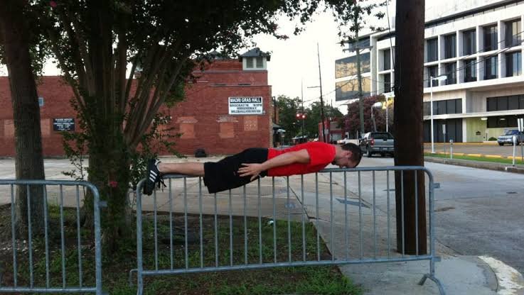
    People posted photos lying stiff as a board in the strangest places they could find.
  • The USB cables come pre-tangled on purpose, and that is the least strange thing in the shop

    The USB cables come pre-tangled on purpose, and that is the least strange thing in the shop

    Walk in off the street and the first thing you notice is that everything is where it should be. There is a hot food counter near the front. There is a wall of refrigerators at the back. There are aisles, shelves, a checkout, the slightly too bright lighting every corner store in the world seems to buy from the same catalogue. Then you pick something up and the whole thing falls apart in the best possible way.

    The charging cables are tangled. Not accidentally tangled, the way the one in your bag is tangled. Somebody sat down and tangled them, deliberately, by hand, and then priced them and put them on a hook. The mugs are beaded so beautifully that it takes a second to register they have holes in them and will leak the moment you pour anything in. There are corn dogs on the hot counter with googly eyes glued to them. There is a landline telephone shaped like an iPhone that, when you pick it up, plays exactly one song by U2 and nothing else.

    This is the Inconvenience Store, and it lives in a former 7-Eleven on one of the most argued-about street corners in downtown Seattle. Entry is free. Everything inside is for sale. Prices start at one dollar and run to ten thousand, which is a range you do not usually see inside a single room, let alone a single room with a slushie machine footprint still visible on the floor.

    More than seventy artists, most of them local, made the stock by hand. The organisers count fourteen departments, laid out the way a real convenience store is laid out, with food and pantry in one place, health and beauty in another, office supplies in a third. That arrangement is the entire trick. If you hung these objects on a white wall with little cards beside them, most people would walk past and feel vaguely told off. Put them on a shelf under a department sign and the same people pick them up, turn them over, and ask how much.

    The two people behind it are Lilia Deering and Mary Anne Carter, and they have done a version of this before. Two years ago they built STÖR, an art exhibition shaped like a trip through a Swedish flat-pack furniture warehouse, complete with arrows on the floor telling you which way to walk and meatballs served on certain evenings. Thirty-four other artists made work for it. You could buy a mirror framed entirely in dentures for two hundred and seventy-five dollars. There was a vase shaped like a traffic cone for sixteen. There was a chaise longue built to look inflatable but actually hand-made out of stretched canvas, at fifteen hundred. There were meatball pillows, fifty dollars each, and yes, people bought them.

    STÖR was supposed to be a gag and turned into something closer to a phenomenon. It reportedly pulled well over ten thousand people through the door, which is a number most small galleries would consider a fantasy. Carter and Deering had accidentally proved something that the art world has been circling nervously for decades, which is that an enormous number of people are genuinely interested in art and are simply put off by the room it is usually kept in.

    Deering has been fairly blunt about the reasoning. Galleries with white walls and no visible prices can feel intimidating. You walk in, somebody at a desk looks up, nobody tells you what anything costs, and the unspoken message is that if you have to ask you are not the customer. A convenience store says the opposite thing before you have taken two steps. It says: browse, touch things, leave without buying anything, nobody is watching you. Carter has described the aim as turning the usual dynamic upside down, putting out things that can stay with a person for the rest of their life rather than things that stay behind glass.

    So that is what the Inconvenience Store is, in the plainest terms. It is a gallery that has disguised itself as the least intimidating building type humans have ever invented.

    The location is not an accident, and it is where the story gets more interesting than a good joke about cables.

    The corner of Third Avenue and Pine Street has spent years as shorthand for everything people worry about in an American downtown. It is a transit spine, a place where bus lines converge and a light rail station sits directly underneath, which means enormous numbers of people pass through it and almost nobody lingers. Retailers left. Storefronts went dark and stayed dark. Local coverage and civic argument circled the same block so often that the block itself became a symbol, which is a miserable thing to happen to a street, because symbols are very hard to live on.

    The 7-Eleven on that corner closed and the space sat empty, which is roughly the most ordinary thing that can happen to a piece of American retail and also the most demoralising, because an empty convenience store is a building admitting that not even the lowest bar of commerce is worth clearing here.

    Then a nonprofit bought the whole building.

    The tower above the shop went up in 1910 and spent most of a century as offices. Base Camp, an arts nonprofit, closed on it last spring for somewhere around two point eight million dollars, working out at roughly sixty-six dollars per square foot, which in a major American city is less than people pay for parking spaces. The plan is to turn the upper floors into housing and studio space for artists, with the middle floors deed-restricted for people earning well below the area median, a community space on the second floor, market-rate apartments at the top, and the ground floor kept as retail. Habitat for Humanity is lined up to steward the affordability side long term. Residents are not expected to move in for another couple of years. The building has been given a new name, Parnassus, after the mountain the Greeks assigned to the arts, which is either very grand or very funny depending on your mood as you walk past the old slushie counter.

    The man behind Base Camp is Nick Ferderer, and his path to owning a hundred-and-sixteen-year-old tower is not the one you would guess. He grew up in the Pacific Northwest, worked in government relations and legislative advocacy, spent time at the US Department of Commerce and then at Microsoft, and picked up an MBA along the way. In 2022 he opened a small studio and gallery space in Belltown, mostly to give local artists somewhere to show work. By his own account, word spread and the thing snowballed faster than he had planned for. When Microsoft laid him off the following year, he stopped treating it as a side project. He has said he was having too much fun to go back to corporate life, which is the sort of line people usually say to be charming and in his case appears to have been a straightforward description of events.

    A second space followed, in a long-abandoned building on Third Avenue that required clearing something in the region of fifty-five thousand pounds of debris before anyone could stand in it safely. It now holds studios and galleries, and it drew a two hundred thousand dollar grant from a major regional foundation, spread over three years. Other businesses have opened nearby since. Whether the block’s foot traffic has genuinely improved is a claim you will hear in local coverage rather than a figure anyone has measured, so treat it as an impression rather than a statistic, but it is an impression a lot of people on that street seem to share.

    Seattle is not alone in trying this. The city runs a programme that pairs artists and small businesses with empty shopfronts, and it has put work or pop-ups into dozens of vacant storefronts over the past few years. The logic is simple and slightly cynical and completely correct: an empty window tells everyone walking past that this place has given up, and a window with something weird and hand-made in it does not. You cannot fill a downtown with galleries. You can stop a street from looking abandoned while the slower fixes are argued over.

    What makes the Inconvenience Store land harder than most of those efforts is that it did not soften the building to make it presentable. It kept the fixtures. The refrigerator section, the bit where the energy drinks used to live, has been converted into an actual white-walled gallery with its own rotating shows, a small climate-controlled room inside the shop where the serious art is kept, which is a joke and a sincere curatorial decision at the same time. There is a sound sculpture built to behave like a cash machine. The hot bar holds fake food. The aisles hold the abstracted versions of everything you would run in for at eleven at night.

    The stock list is where you start laughing properly. Shoulder bags stitched together out of snack packaging, the foil insides of Cheetos and Lay’s bags turned into something you would genuinely carry. Beeswax candles shaped like eggs, sitting in the spot where the egg cartons ought to be. Ceramic eggs meant for your face. Soft sculpture keychains by the textile artist Shiloh Davies, starting around twenty dollars and rising to about a hundred and twenty depending on the piece. Lighter cases encrusted entirely by hand by Emma Kates-Shaw, sixty-five dollars each, an object worth more than the lighter inside it by a factor of about twenty.

    The ten thousand dollar figure at the top of the range gets quoted a lot, and it is worth being careful about it. It is the ceiling of the stated price range, the most expensive object in the room. It is not a sale anyone has recorded. The far more revealing number is the other end. One dollar. There is something in there that costs one dollar, which means nobody who walks in off a bus is priced out of leaving with an original piece of art made by hand by a person who lives in their city.

    The show grew as it went. When it soft-opened at the end of last summer, the preview coverage counted more than fifty artists involved. By the official launch a few weeks later the count had passed seventy. That is not marketing inflation, or at least it does not read like it. It is what happens when a project becomes the thing local artists want to be in, and people keep asking whether there is room on a shelf. The organisers supply the headline counts themselves, seventy artists and fourteen departments, so they are the house’s own figures rather than an audited inventory, but the growth between the two openings is visible in the coverage on either side of it.

    It is open on Saturdays and Sundays only, noon until four. That is twenty hours a month, which is not much, and it is also the one genuinely inconvenient thing about the Inconvenience Store, a fact nobody involved seems remotely embarrassed by. It is scheduled to run through the middle of next year, which gives it an unusually long life for a pop-up and means it will still be there when the construction above it gets going in earnest.

    There is a line Deering has used about why the whole thing is called what it is called, and it is better than the gag suggests. Art is inherently inconvenient. We live in an economy that rewards speed and scale and doing things the cheap way, and artists insist on doing things the hard way, by hand, slowly, one at a time. A pre-tangled cable is funny for about four seconds. Then you realise somebody tangled it deliberately, spent their time on it, and is asking you to notice the difference between a thing that was made and a thing that was manufactured. Convenience is the whole promise of the building you are standing in. The stock is quietly arguing that the promise costs more than it looks like it costs.

    What is easy to miss, standing in there holding a mug that will leak, is how much ordinary municipal machinery had to line up for a silly shop to exist. A tax programme for converting empty offices into homes. A nonprofit willing to buy a hundred-year-old building at a price that only made sense because nobody else wanted it. A housing charity agreeing to hold the affordability line for decades. A city scheme for filling dead windows. Two artists with a proven record of making people queue for a joke. None of that is glamorous, and all of it had to happen before anybody could glue a googly eye onto a fake corn dog.

    The building’s future is already written in planning documents. The upper floors become homes for people who make things, at rents they can actually pay, on a corner that spent years being described as a problem. The shop downstairs will keep selling hand-tangled cables until the middle of next year, and then it will presumably become something else, a real shop, a café, whatever a ground floor becomes when the block around it has a reason to slow down.

    For now, on weekend afternoons, people get off the bus at a corner they have been told for years to hurry past, see a lit-up convenience store, walk in expecting a drink, and find seventy of their neighbours’ imaginations arranged by department. Some of them leave with a one dollar object they will keep for thirty years. That is a strange outcome for an empty 7-Eleven, and a much better one than the block had any right to expect.

  • The river came the way it always does. This time, nobody in the district drowned, and the reason was a class that had not finished its course.

    The river came the way it always does. This time, nobody in the district drowned, and the reason was a class that had not finished its course.

    Kátia Manjate had never touched a drone in her life. A year or so later she was flying one over a river that had climbed halfway up the walls of people’s houses, looking for families stranded on roofs, and passing their positions to the men in the boats.

    She was not supposed to be doing that yet. She was part of a training cohort, a group of Mozambican civil servants who had been pulled out of meteorology offices, road agencies, water management and the national disaster institute and taught, from nothing, how to fly and how to turn what the aircraft saw into usable maps. The course had a syllabus and a timetable and a graduation date. The Incomáti River did not consult any of them. When the water came, the class was roughly half finished, and it was deployed anyway.

    What happened afterwards is the part that has travelled furthest, and it needs to be said carefully, because the version circulating online is not quite the version in the documents. In Marracuene, the district north of Mozambique’s capital where the river burst its banks and where the drones flew, not a single life was lost. That is remarkable and it is real. It is also specific to that district. Nationally, the same flooding killed 12 people and affected 692,522, according to the African Development Bank’s own account of the emergency, which also records more than 1,300 kilometres of road destroyed, over 100,000 hectares of farmland ruined, tens of thousands of livestock lost, and a school year pushed back because the schools were full of water.

    The damage figures are worth reading slowly, because they describe a different kind of loss from the one a death toll measures. More than a hundred thousand hectares of farmland ruined is a year of income gone for households that do not have a second year of savings behind them. Tens of thousands of animals lost is the same thing in another form, since livestock in much of the region functions as a bank account with legs. The postponed school year meant hundreds of thousands of children starting late because the buildings were underwater or being used to shelter families. None of that appears in a casualty figure, and all of it is still being worked through.

    So the honest headline is not that a country came through its worst flooding in decades without a death. It is that in the one district where a new piece of technology and a half-trained crew of local pilots were actually in the air, the water took nobody. Those are different claims, and the smaller one is the more interesting of the two, because it can be examined.

    The flooding ran for most of a month at the start of this year, after weeks of rain that the ground had no capacity left to absorb. Marracuene sits on low, green, heavily farmed land where the Incomáti widens on its way to the sea, which is exactly the kind of place that floods and exactly the kind of place people farm anyway, because the same river that drowns the fields is the reason the fields are worth having. The district’s mayor, Ahmad Shafee Sidat, described watching all of that green vanish under water, with the flood standing higher than half the height of the houses.

    This is not a new experience there. Mozambique’s coastal plains flood on a rhythm that everybody who lives on them understands, and the historical pattern is that the counting afterwards is a count of the dead. What was different this time was that somebody up above could see.

    The project behind it had been running for less than a year when the river arrived. It was launched by Mozambique’s government together with the African Development Bank, financed through a trust fund built on South Korean money for African economic cooperation, with technical work from a Korean technology park. The equipment package was substantial: nine drone systems, four of them for training and five for operations, fitted with cameras and laser scanning instruments that measure distance and height, plus simulators, unmanned surface craft for working on water, and the data platforms needed to turn all of it into maps. A dedicated training centre opened a few months before the flood, and the plan covered five flood-prone zones of the country.

    The funding route is unusual enough to be worth explaining, because it shapes the outcome. The money did not come as bilateral aid from one government to another. It came through a trust fund set up for economic cooperation between South Korea and African countries and administered by the African Development Bank, which means the design was made by a development institution rather than a donor ministry, and development institutions tend to be judged on whether a capability still exists in five years. That is a bureaucratic detail that turns out to explain the training-first structure entirely. An agency measured on delivery counts hands over drones. An agency measured on outcomes builds instructors.

    It also explains why the equipment list includes things that look redundant at first glance. Four of the nine aircraft were designated for training rather than operations, which is a quarter of the budget spent on machines that were never meant to fly a real mission. Simulators were included as well. Somebody had clearly seen what happens when a fleet is bought without spares for the learning curve, and every aircraft is too precious to risk a beginner on.

    The crucial design decision was made early and it is the reason this story exists. The money could have bought aircraft and handed them over, which is how a great deal of disaster technology arrives in a country and then quietly stops working when the first battery dies or the first software update breaks something. Instead the project was built around training Mozambicans to fly, to maintain, to process the imagery, and eventually to teach other Mozambicans. The hardware was the smaller half of it.

    Manjate has described learning the full pipeline, not just the flying but everything from collecting the data to producing the finished product at the other end, which in practice means she can take an aircraft up, bring the imagery down, and hand a rescue coordinator something he can act on. That is a different skill set from operating a camera.

    Another of the pilots, Hermelinda Nhamuche, spent the emergency mapping roads. It sounds like the least dramatic job in a flood and it is close to the most important one. When a plain goes under, the roads do not simply become wet. Some of them are gone, some are passable, some are passable only by a vehicle with clearance, and the difference between them is invisible from a boat or a truck cab. Rescue teams heading into flooded terrain without that information are guessing, and a guess that puts a truck into a washed-out section turns rescuers into people who need rescuing. Nhamuche’s maps fed straight into search and rescue planning.

    The drones themselves were not doing anything exotic. They were flown low over the flooded area to find specific families on specific roofs, to establish where the water was deep and where it was shallow enough to drive, and to send live pictures back to the people making decisions. The laser instruments gave depth and elevation, so a route could be assessed rather than attempted. None of this is science. It is the ordinary, unglamorous business of knowing where people are before you go to get them, which is precisely the thing that has always been missing.

    There is a detail that gets skipped in most accounts and deserves to be kept, which is that some of the drone operators had been ordinary office staff a year earlier. The cohort was drawn from public institutions, together with personnel from the security forces, and the emergency required them to work with Korean specialists flying alongside them while they were still learning. About twenty of them were operational when the flood began.

    Preciosa Mondlane, described in reporting as someone who lived through the flooding herself, was among those who saw the aircraft overhead. It is worth being careful with that kind of testimony. A person on a roof watching a small machine circle above them cannot know whether it is the reason a boat arrives an hour later, and the reporting does not establish a chain between any single flight and any single rescue. What can be said is that the district’s coordinated response had eyes it did not have in previous floods, and that at the end of the emergency its casualty count was zero.

    The mayor has credited the partnership directly for that outcome. It is his district and his judgement, and it carries weight, but it is a judgement rather than a measurement. Nobody can run the counterfactual. Floods vary, the warning came at a certain hour, the population moved at a certain speed, and disaster outcomes are always the product of a dozen things happening at once. The careful claim is that a district which historically loses people did not lose any in its worst flooding in decades, and that the most conspicuous new element in its response was a fleet of drones flown by local staff.

    The national picture puts a necessary frame around it. Twelve people died elsewhere. Nearly 700,000 had their lives disrupted. Gaza Province, well to the north, took the heaviest damage, and the drone operations there began in the last days of the emergency, after coordination meetings, focused on districts along another flooded river. So the technology was not evenly present, the response was not uniform, and the country did not come through unharmed. It came through with one district that had something the others did not, which is the beginning of an argument rather than the end of one.

    What happened next is the part that decides whether this was a lucky season or a working system. The cohort grew from the twenty who flew in the emergency to thirty trained specialists drawn from across the relevant agencies. By the middle of this year, all thirty had received national certification, and ten of them had been brought on further as instructors, meaning they are now licensed to train the next group themselves.

    That number, ten, is the one worth watching. A trained pilot is an asset that decays: people move jobs, take other posts, leave the sector. A trained instructor is a multiplier, and ten of them inside the national system means the country can produce its own operators without a foreign technical partner in the room. It is the difference between having been given a capability and owning one. The project’s stated aim from the start was a skilled national workforce able to run disaster response with confidence and on its own authority, and the instructor certifications are the first hard evidence that the aim was not just language for a press release.

    Mozambique is a reasonable place to test the idea, because it is one of the countries most exposed to climate-driven disaster on the continent. Its long coastline takes cyclones. Its river basins drain highlands in neighbouring countries, which means a flood can be generated by rain that never fell on Mozambican soil. The population lives disproportionately on the low, fertile, dangerous ground. Weather that used to be exceptional is arriving more often, and the country’s capacity to see what is happening in real time has not historically matched the frequency of what happens.

    Drones do not fix any of that. They do not stop a river, protect a farm, or rebuild 1,300 kilometres of road. What they change is the quality of the first six hours, which is the window in which most preventable deaths in a flood occur. Knowing that there are four people on the roof of a particular house on a particular lane, and that a truck can reach within 300 metres of it by going the long way round, is worth more in that window than almost any amount of equipment arriving later.

    For Manjate and Nhamuche, the story ended somewhere very different from where it started. They began as public servants with no aviation background whatever, enrolled in a course because their departments sent them. They finished it in the worst conditions the job is ever likely to offer, before they were qualified, with people on roofs below them. Now they hold national certification, and some of their classmates are the ones standing at the front of the room for the next intake.

    There is a version of this story being shared online that says an entire country got through a historic flood without a single death. That version is not true, and the families of the twelve people who died deserve better than to be edited out of a good news headline. The true version is quieter and more useful. In one district, a group of people who had barely learned to fly were sent up early because the water would not wait, and everybody who lived there came out the other side. They are now teaching others how to do it.

  • She helped build one of the most wired countries on earth. Now she practises on a fake machine before she dares use a real one.

    She helped build one of the most wired countries on earth. Now she practises on a fake machine before she dares use a real one.

    In a community centre in a city south of Seoul, a 79 year old woman named Hwang Sun-hee stood in front of a machine that looked exactly like the payment kiosk in a hospital lobby. Same screen, same slot for the card, same brisk little prompts. The difference was that this one was not real. Nothing she tapped would charge her, reject her, or freeze while a queue built behind her. It was a training kiosk, brought in on a van, set up so that people her age could make every mistake they were afraid of making in public, in a room where nobody was waiting.

    She practised paying a hospital bill. Then she met a robot dog, because the same programme that teaches kiosks also teaches the rest of it, the phones and the apps and the artificial intelligence everyone keeps talking about. Afterwards she said something quiet and a little heartbreaking, which was that she envied young people for how easily all of this comes to them, and that she wished she had been born into this version of the world instead of arriving at it late.

    That sentence is the whole story, and it belongs to a generation that has a particular claim on the country doing this to them. South Korea did not drift into being one of the most connected places on the planet. It went from a largely rural, war-damaged economy to a global technology exporter inside a single working lifetime, and the people who now cannot order a bowl of noodles from a touchscreen are the same people who worked those decades. They built the country that now asks them to tap a screen they cannot read.

    The scale of the gap is not anecdotal. A state survey cited in recent reporting found that around 60 percent of Koreans over 60 have difficulty using public and commercial services because their digital skills are limited. Among people under 40, the figure was about 6 percent. Ten times the difficulty, in the same shops, in the same hospitals, in the same country, depending on when you were born.

    Those two numbers do a lot of work, so it is worth being precise about what they are. They come from a government survey reported in coverage of the issue, not from an independent academic study, and they measure self-reported difficulty rather than a tested competence score. That still means something real. Sixty percent of an age group saying they struggle with the machines that now stand between them and food, medicine and transport is not a rounding error.

    What makes it bite is how fast the replacement happened. The human being who used to take the order in a fast food restaurant, sell the ticket at the counter, or check you in at the clinic reception has in a great many places been turned into a screen. That transition happened over a handful of years, not a generation, and it happened without any transitional period in which both options existed side by side. One week there was a person. The next week there was a panel with a scrolling menu, a timeout counter, and small type.

    Kiosks are a particularly cruel piece of design for anyone who learns slowly under pressure. They are built for throughput. The screen assumes you already know the vocabulary of app interfaces, that you understand a hamburger menu and a back arrow and the difference between a confirm button and a next button. It assumes you can read small text quickly. It assumes, above all, that you are not embarrassed. And embarrassment is the part nobody designs for. A person who takes ninety seconds at a machine while four people wait behind them will usually give up and walk out before they take a hundred and twenty.

    The curriculum is broader than the machines, which tells you how the people running it understand the problem. The sessions cover smartphones and the apps that now sit between people and their own money, and they cover artificial intelligence, and that is why there was a robot dog in the room with Hwang Sun-hee. It sounds like a gimmick and it is not entirely one. A person who has been quietly told for five years that technology is not for them will not walk into a room and start pressing buttons. Something has to break the ice first, and a mechanical dog that responds when you talk to it does that better than a handout.

    There is also a practical reason to teach the general shape of these interfaces rather than one specific machine. Kiosks are not standardised. The ordering panel in one restaurant chain looks nothing like the one next door, and the hospital payment terminal follows a third set of conventions entirely. Learning one by memory gets you through one lobby. What the training is actually trying to install is the grammar underneath them all, the idea that there is always a back option, that the screen is waiting rather than judging, that a wrong tap is recoverable.

    The transport version of this is the one that gets described most vividly. Reporting on the issue quoted a 71 year old retiree who stood at the kerb for more than half an hour trying to flag down a taxi by raising his hand, the way it has always been done, while younger people around him were collected within seconds by cars that had been summoned through an app. He said he felt utterly useless. Not inconvenienced. Useless.

    The mechanics behind that scene are simple and brutal. Roughly nine in ten drivers now work through ride-hailing apps, which means the supply of cars that can even see a raised hand has collapsed. A driver on his way to an app booking is not available to you no matter how visible you make yourself. The street has not stopped working because of rudeness. It has stopped working because the street is no longer where the transaction happens.

    There is a figure that circulates alongside this, that more than 80 percent of older people still hail cabs by hand. It is worth flagging what that number actually is. In the original reporting it is an estimate offered by a taxi driver describing what he sees on his shifts, not a measured statistic from a survey or a transport authority, and some trade coverage has since repeated it as though it were data. The direction of it is almost certainly right. The precision is not. It is a working man’s impression of his own city, and it should be read that way.

    The small details are often the ones that land hardest. Baseball clubs, of all things, have begun setting aside tickets for in-person sale after reports of older fans standing near ticket machines and asking younger strangers to buy for them. Think about the sequence of decisions inside that. You want to go to a game. You get to the stadium. You cannot operate the last twenty seconds of the process. So you look for a stranger kind enough to take your money and press the buttons, and you hope they are patient, and you hope they are honest, and you accept that this is now part of going to a baseball game.

    Multiply that by hospital appointment check-in, by bank branches that have closed in favour of an app, by government paperwork that has moved to a portal, by restaurants where the only way to order is the panel by the door. Each one alone is an irritation. Together they add up to a slow, unannounced withdrawal of a person’s ability to do their own errands, which is very close to a withdrawal of independence.

    This is where the country’s response gets genuinely interesting, because it is not a leaflet campaign and it is not a hotline. Public technology training for older people has been running since 2020, and the numbers involved are large. In one recent year, more than 65,000 training sessions were run and roughly 650,000 people over 60 took part. Those are last year’s figures, not this year’s, and the programme is now several years old, so this is not a brand new idea being announced. It is an established thing that has quietly got very big.

    The part that makes it work is the physical part. Instead of asking older people to come to a training centre in another district, the training drives to them. Vans arrive at community centres and local events carrying devices and, crucially, mock kiosks. Fake machines. Hardware built to be practised on. Somebody looked at the problem, understood that the barrier was not intelligence but exposure and fear of an audience, and responded by manufacturing consequence-free versions of the machines that were frightening people.

    There is something slightly absurd about it in the best way. A country famous for shipping the future to everyone else is building replicas of its own ordering screens and driving them around in the backs of vans so that pensioners can fail at them privately first. It is the opposite of the instinct most institutions have, which is to tell people to try harder and put the instructions online, where the people who need them cannot get to them.

    Trade coverage of the same issue has put out a second pair of numbers that complicates the picture in a useful way. Kiosk use among older residents has apparently risen sharply, with something in the region of seven in ten reporting they use them more than they used to. But well over six in ten still say they find them difficult. Both things are true at once. People are using the machines more and disliking them just as much, which is what compulsion looks like when it is dressed up as convenience. Nobody chose this. The alternative simply stopped existing.

    It is worth sitting with what the medical and administrative side of this means, because that is where the stakes stop being about convenience. As more hospital check-in, prescription handling, benefits paperwork and civil documentation move to portals and terminals, the people most likely to need those services frequently are the people least able to reach them unaided. An older person who cannot complete a form online does not simply wait longer. They often need to ask a relative, and if the relative lives in another city or does not exist, they need to ask a stranger, or they go without. A system that quietly requires a helper has redefined what it means to live alone.

    That is also why the fix has to arrive as hardware rather than instruction. You cannot teach somebody to use a kiosk by telling them about it over the phone. The muscle memory is the whole skill, and muscle memory needs a machine.

    The demographic backdrop is why none of this is going to resolve itself by waiting. South Korea is what is formally called a super-aged society, meaning more than one in five of its people are 65 or older. It is also among the fastest-aging countries in the world, which means the group that struggles with these interfaces is not a shrinking legacy population to be managed for a few more years. It is growing. Every design decision that assumes a fluent user is a decision that will exclude more people next year than it did this one.

    Which raises the question that the training vans cannot quite answer. Teaching millions of older people to use badly designed machines is a decent emergency response, and it is clearly doing good for the individuals who walk out of those sessions able to pay a hospital bill. But it puts the entire burden of adaptation on the person with the least power in the exchange. The machines themselves could be different. Bigger text, slower timeouts, a single obvious start button, a physical help key that summons a human, a permanently staffed counter in any venue above a certain size. None of that is technically hard. It is a matter of who a company decides its customers are.

    A few places have started to move in that direction, mostly the ones that got publicly embarrassed. The baseball ticket carve-out is an example of exactly that, a venue admitting that a portion of its most loyal audience had been locked out and quietly restoring the old route. It is not a policy revolution. It is one door being propped open again. But the pattern matters, because every one of those small restorations is somebody inside an organisation deciding that an older customer is still a customer.

    For Hwang Sun-hee, the resolution is smaller and more concrete than any of that. She spent an afternoon in a room with a machine that could not humiliate her, and she learned the sequence of taps that pays a hospital bill, and then she went home knowing the sequence. The next time she is standing in a real lobby with real people behind her, she will have done it before. That is the entire product. Not empowerment, not digital transformation, just the specific and enormous relief of not being a beginner in public.

    There is no tidy ending here, because the country is still building the machines faster than it is teaching people to use them, and the generation most affected is the one least likely to complain loudly about it. What has changed is that somebody is no longer pretending the problem is the users. The vans are an admission, in metal and plastic, that a society moved faster than it brought its own people with it, and that the fix has to be brought to the doorstep rather than posted online.

    And if you want the measure of what it costs to be left behind by an interface, it is not the survey figure. It is a man on a kerb with his arm raised for half an hour in a city full of taxis, watching them all go somewhere else, deciding that the problem must be him.

  • Somebody signed it “L daVinci”. Then a laser found a blue that had not been invented yet

    Somebody signed it “L daVinci”. Then a laser found a blue that had not been invented yet

    You have to hold the painting at the right angle to see it at all. The signature sits low on the canvas, under the emperor’s elbow, and the contrast against the dark ground behind it is so faint that from straight on there is nothing there. Turn it, let the light come in from the side, and eight letters surface out of the varnish. L daVinci. After them, another word, worn down but almost certainly pinxit, the Latin for painted this.

    The family who own the picture have had it since the late 1930s. They are not a museum and they have never wanted their name attached to it. In the 1920s, before it came to them, Christie’s had catalogued the painting as a Titian, which is a serious attribution and by itself would make it a significant object. The signature was not visible then, or at least nobody recorded it. For decades the canvas hung with generations of soot and darkened varnish sitting on top of it, and whatever was written under the elbow stayed under the elbow.

    Then the siblings who inherited it in the mid-1990s started asking the question that anyone would ask, and kept asking it for the better part of thirty years. If the name is really there, is the name true?

    It helps to know why anybody would bother. A painting attributed to Leonardo is not just a nice picture with a good name on it; there are fewer than twenty in the world that scholars broadly accept, and the arithmetic that follows from that scarcity is brutal. A panel called Salvator Mundi, heavily damaged and heavily restored and argued over by specialists who could not agree how much of it Leonardo actually touched, sold at auction some years ago for a reported 450 million dollars, the highest price ever paid for a painting. That single number sits behind every claim of this kind. It is why families dig out old canvases, why laboratories get asked to look at them, and why art historians treat every new candidate with a wariness that can come across as unkind.

    That question eventually reached a materials science department at Uppsala University in Sweden, where a group ran the painting through Raman spectroscopy. The result, published online in the journal Materials Today Advances earlier this year and picked up widely by the press some months later, is one of the more honest pieces of art science to come out in a while, because it refuses to give anybody the answer they want.

    Raman spectroscopy is a beautifully simple idea dressed up in expensive equipment. You shine a laser at a spot on a surface. Almost all of the light bounces back at exactly the energy it arrived with, which tells you nothing. But a tiny fraction of it comes back shifted, having given up or gained a sliver of energy to the vibration of the molecules it hit. Every compound has its own set of vibrations, so every compound shifts the light in its own particular pattern. Collect the scattered light, read the pattern, and you have a molecular fingerprint of whatever is sitting at that spot. Jakob Thyr, who ran the analysis, describes it in roughly those terms: the scattering gives you a fingerprint for every pigment present.

    What makes it useful for paintings is that pigments have birthdays. A painter can only use what exists. Nobody in 1500 could reach for a colour that would not be made for another two hundred years, and no amount of skill or intention gets around that. So if you can name the compounds on a surface, you can put a floor under the date of the surface. You cannot prove a painting is old. You can absolutely prove that part of it is not.

    The team sampled thirteen locations across the canvas and came back with thirteen pigments. Eleven of them are exactly what you would expect from a painter working in the Italian Renaissance, and reading the list is like reading a period supply order. Lead white through the flesh and the textile. Cinnabar, the brilliant mercury red, in the hairband and the armour and the lit arm. Red ochre and yellow ochre and plain earth pigments. Gypsum and chalk. Massicot, a lead yellow, in the ear. Lead-tin yellow type one, which is genuinely diagnostic, because it fell out of use in the eighteenth century and was then forgotten so completely that it had to be rediscovered by chemists in the twentieth. Azurite in the armour. Terre verte, the green earth that Italian painters traditionally laid under skin tones. Natural ultramarine, ground from lapis lazuli hauled overland from Afghanistan, which in this period cost more by weight than gold and which nobody wasted on a fake.

    Then there is location B, a dark laurel leaf in the wreath around the emperor’s head, and location I, the jewel set into the pommel of his sword. Both came back with Prussian blue.

    Prussian blue was not around when either Leonardo da Vinci or Titian was alive. It was not around when anybody was alive who might plausibly have painted a Renaissance portrait. It was made for the first time in Berlin in the early 1700s, and the paper puts the date at 1704. It was also an accident. A colour maker was trying to produce a red lake pigment and used potash that had been contaminated with animal residue, and instead of red he got a deep, strong, startlingly cheap blue. Until that moment, if you wanted a serious blue you either bought ultramarine at a price that could bankrupt a commission or you settled for something duller. Prussian blue undercut all of it, and within a couple of decades it was everywhere in European painting.

    For anyone who studies pictures for a living, that accident is one of the most useful clocks in existence. Leonardo died in 1519. Titian died in the 1560s. Prussian blue simply cannot be in an untouched fifteenth or sixteenth century paint surface, and its presence is not a matter of interpretation or connoisseurship or taste. It is a compound with a manufacturing start date.

    Alongside it at the same laurel-leaf spot, the analysis found what is most likely titanium white, a pigment that exists in trace form in nature but which only became a commercial paint in the twentieth century. So the wreath has two anachronisms in one place.

    The obvious reading is forger, and the obvious reading is probably wrong, and the reason is the pattern. A forger painting a whole picture in the wrong century contaminates the whole picture. The modern pigments show up everywhere, in the flesh, in the background, in the drapery, because the forger was working with one palette across one surface. That is not what this canvas looks like. Eleven period pigments are spread across the arms, the armour, the textile, the ear, the hairband, the background. The two modern ones are concentrated in a wreath and a jewel. That is the fingerprint of somebody going back into a finished painting and working on specific areas, which is what restorers and retouchers have done to almost every old picture that has survived this long.

    X-ray imaging supported exactly that. The laurel wreath is not simply painted; it has been structurally altered. The wreath in the painting as it now stands is more elaborate than what lies underneath it. Somebody, at some point after 1704, decided the emperor’s crown of leaves needed more leaves, and gave him more, in a blue that had not existed when the rest of the canvas was made. Thyr’s own framing is that the Prussian blue was most likely added later, during a restoration or retouching, rather than being evidence of a fake.

    Which brings the whole thing back to the eight letters under the elbow, and here the study quietly declines to hand anybody a verdict.

    The signature was sampled too. It is carbon black, which is lamp black or ivory black, one of the oldest pigments humans have, made essentially by collecting soot. No other pigment was found in it. Carbon black is entirely consistent with the Renaissance, and it is also entirely consistent with every other century since, because soot never stopped being soot. The inscription is reported to sit behind aged varnish rather than on top of it, which argues against somebody having scratched a name onto the surface last week, but varnish can be removed and reapplied, and a signature added in the 1800s would sit behind varnish applied in the 1800s just as comfortably.

    So the chemistry of the signature proves that it could have been written by Leonardo. It equally proves that it could have been written by a dealer in 1780 with a pot of lamp black and a strong commercial motive. The single most loaded object on the canvas turns out to be the one the laser has the least to say about.

    The art historians who have looked at the painting are, to put it gently, not persuaded. Charles Hope of the Warburg Institute has said flatly that the picture looks nothing like any work by Leonardo, and has suggested that the signature is the work of an unscrupulous dealer, which was a thriving trade for centuries and remains one. Frances Coulter has described the handling as far too robust and too sharply defined for Leonardo or for anything from his workshop, which is a specific criticism rather than a vague one: Leonardo’s whole reputation as a painter rests on edges that dissolve, on faces that emerge from shadow without ever quite committing to an outline. A hard, confident, well-lit Roman emperor is close to the opposite of that.

    The sitter is worth a moment too, because he is not a flattering choice. Domitian ruled Rome at the end of the first century and was killed in a palace conspiracy. The historians who wrote about him afterwards, working under the regime that replaced him, left a portrait of a suspicious and isolated man, and the Roman senate went so far as to order his name scrubbed from inscriptions and his images destroyed. Some of the cruelty in that account is almost certainly political score-settling by the winners, and modern historians treat it carefully. But it meant that for centuries he was a byword rather than a hero, and an artist who chose to paint him was not painting a crowd-pleaser. He is an emperor in armour with a laurel wreath and a sword, and the wreath is the part somebody later decided to make grander.

    There is also a straightforward problem of chronology that has nothing to do with chemistry. Domitian was not a fashionable subject in Leonardo’s lifetime. He was a Roman emperor whose reputation, as written by the historians who survived him, was thoroughly unflattering, and painted portraits of him seem not to appear at all until the 1560s, decades after Leonardo was dead. Painters of the later sixteenth century did produce sets of the Caesars, and a Domitian belongs comfortably in that tradition. In Leonardo’s, it is an orphan.

    Reported carbon dating of the canvas itself is said to place the support somewhere around 1470, which would put the material firmly in Leonardo’s era, though it dates the cloth rather than the paint on it and dating a support has never been the same thing as dating a picture. Old canvas and old panel have been available to anyone with the money to buy them for as long as there have been people willing to pass off new work as old.

    The authors of the study are clear-eyed about all of this, and their caution is the most valuable thing in the paper. They state that establishing authenticity requires stratigraphic, material and contextual analysis taken together, rather than any single test, and they point out the uncomfortable fact that a sufficiently informed forger can deliberately work in historically appropriate materials precisely because they know somebody will eventually point a laser at the result. Pigment analysis can exclude. It cannot crown.

    What the work does deliver is a real and specific history of an object, which is more than most paintings in private hands ever get. There is a canvas whose paint is overwhelmingly consistent with the Italian Renaissance, made with materials including one, natural ultramarine, that nobody wasted casually. There is a laurel wreath and a sword jewel that somebody went back into at least two centuries later and repainted, making the wreath fuller than it had been. There is an inscription in soot, sitting under old varnish, naming the most famous painter who ever lived, which the science can neither confirm nor kill. And there is a family who have lived with the thing for the better part of a century and now know considerably more about it than they did, without knowing the one thing they actually wanted to know.

    That is a more interesting outcome than a clean answer would have been. An attribution either way would close the file. What the laser found instead is the record of the painting’s own life: a picture made a long time ago, valued enough by somebody to be improved, damaged enough to need fixing, signed by a hand nobody can name, catalogued as one master, claimed for another, and passed down through a family that still will not say who they are.

    It is still hanging in a private home. Nobody is being asked to believe anything. The painting simply carries more documented truth than it did before, and the last piece of it, the eight faint letters that started the whole enquiry, is still exactly as open as it was on the day somebody first tilted the canvas toward the light and saw them there.

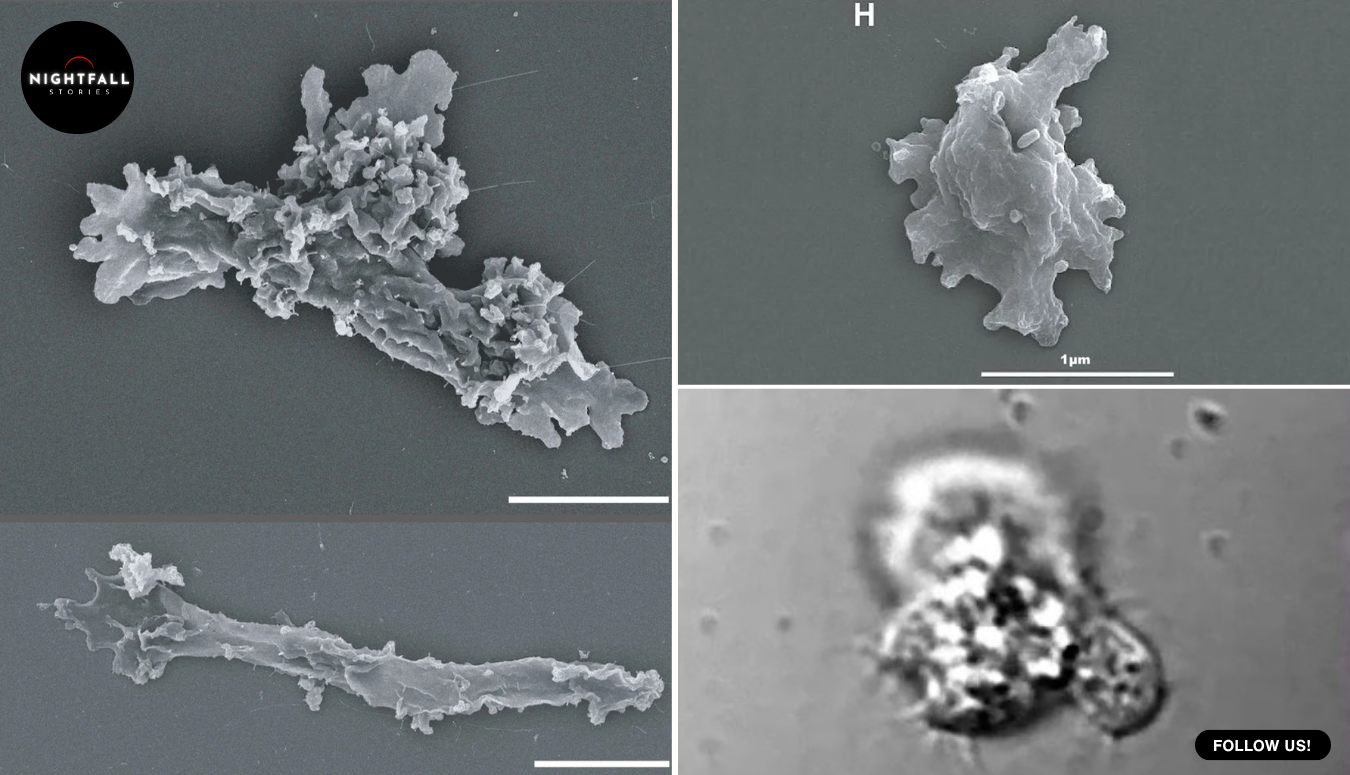
  • Complex life was supposed to stop at 60 degrees. Something in a California creek never got the memo

    Complex life was supposed to stop at 60 degrees. Something in a California creek never got the memo

    The tongs were the kind you use for a barbecue, extra long, the sort of thing you buy so you do not have to put your hand near the coals. A graduate student was using them to lower glass vials into a creek that was hot enough to scald, in a corner of a national park in northern California where the ground still remembers being a volcano. The water coming off that tributary runs anywhere from about 49 to 64 degrees Celsius, which is somewhere between a very hot bath and a temperature that will take skin off in seconds.

    The sampling was not a single afternoon. The team worked that hydrothermal ground over roughly three years, going back to the same steaming features again and again, because what lives in a hot spring shifts with the season and the flow and the chemistry, and one visit tells you almost nothing. The park sits on a volcanic system that has never entirely gone quiet, and the surface of it boils and steams in patches, with mud pots and hot pools and creeks running off them. Heat is only half of what makes those places hostile. Many hot springs are also fiercely acidic, and acid is its own separate barrier to life, which is one reason the temperature question had never been cleanly answered. The stretch of water this amoeba came out of was close to neutral, above pH 6, which means the heat was doing the work on its own without acidity muddying the picture.

    She was collecting water, biofilm and a little sediment, and she was not expecting to break anything. She was expecting to find bacteria, because that is what everybody finds in water that hot. What came back to the lab instead was a single-celled creature with a nucleus, an actual complex cell, cheerfully dividing at a temperature the textbooks had spent decades insisting complex cells cannot survive.

    The line was 60 degrees Celsius, and it was not an arbitrary line. For as long as anyone had been sampling hot springs, the pattern held with irritating consistency. Below roughly 60, you find eukaryotes, which is the scientific word for everything built the way we are built, with a nucleus and internal compartments and machinery tucked inside membranes. Above 60, the eukaryotes vanish and you get only bacteria and archaea, the simpler lineages that have been in the heat business since the beginning. The boundary was so reliable that it stopped being an observation and quietly became a rule.

    The reasoning behind it is straightforward enough that you can feel it in your own body. Heat takes proteins apart. It unfolds them, it makes them stick to each other, and once they are stuck together they stop doing the job they exist to do. Heat also thins out membranes until they leak. A bacterium has one membrane and a relatively small set of things that can go wrong. A complex cell has membranes everywhere, wrapped around the nucleus, folded into energy-producing compartments, threaded through the whole interior, and every one of those surfaces is one more thing that can fail at once. The more elaborate the cell, the more ways the heat can kill it. That was the explanation, and it was a good explanation, and it was holding up an assumption nobody had seriously tested in a while.

    Beryl Rappaport, a doctoral student at Syracuse University, was working through the samples under a microscope, filming what she saw. Amoebae are not dramatic to watch in real time. They ooze. But when she sped the footage up, the motion became obvious, the slow shove of a pseudopod pushing out and pulling back, the whole body changing shape as it went. Something in water that hot was moving like a complex cell because it was one.

    The lab, run by microbial ecologist Angela Oliverio, did the obvious thing next and started turning the heat up. They cultured it, warmed it, and watched to see where it would quit. It did not quit at 60. It was active and dividing anywhere from about 42 degrees all the way to 63, with its most enthusiastic replication happening around 57. At 64 it was still moving. Past that it stopped trying to live an ordinary life and did something else instead: it pulled itself in, sealed itself into a protective cyst, and rode out exposure to 70 degrees, roughly 158 Fahrenheit, then came back when the water cooled. Oliverio has said that this was the point at which the team’s minds were fairly well blown.

    Three degrees does not sound like a revolution. If your oven is three degrees off you will never notice. But the researchers were not really measuring three degrees. They were measuring whether the wall was a wall. Oliverio’s framing of it was that the size of the increment mattered far less than the fact that the thing could be done at all. A limit that turns out to be crossable by three degrees is a different kind of object from a limit that cannot be crossed. It is no longer a law of chemistry. It is just the highest number anyone had happened to find.

    They named it Incendiamoeba cascadensis, which unpacks to something like fire amoeba of the Cascades, after the mountain range the creek runs through. Under the microscope it is long and slightly worm-like, pushing out fingers of itself as it goes. Genetically it sits near the genus Echinamoeba, and its closest known relative is Vermamoeba vermiformis, a common amoeba that lives in perfectly ordinary water and has no interest whatsoever in being boiled. Which means this is not some ancient heat-dwelling lineage that has been down there since the planet was young. It is a fairly normal kind of organism that figured out how to go somewhere normal organisms do not go.

    It is also worth being clear about what an amoeba actually does for a living, because it changes what the finding means. Amoebae are grazers. They crawl around engulfing bacteria, which makes them predators in the smallest sense of the word, and in ordinary water they are a significant part of how bacterial populations get kept in check. The standard picture of a hot spring above 60 degrees was a place with no such pressure at all, bacteria and archaea multiplying in peace because nothing up there was equipped to eat them. If a complex cell can live and hunt at 63 degrees, then those communities are not the simple, predator-free systems they were assumed to be, and the food webs in geothermal water may be more layered than anyone had drawn them.

    The obvious follow-up question was whether they had found a freak. One creek, one oddity, a curiosity and nothing more. So the team went looking in the enormous piles of genetic data that researchers have been collecting from geothermal sites around the world for years, sequencing everything in a sample without necessarily knowing what any of it is. Matching signatures turned up in material from geothermal ground in Yellowstone and in New Zealand, thousands of miles apart. Whatever this animal is doing, it is not doing it alone in one stream in California. It has been in those databases the whole time, unread.

    It is worth saying where the 60 degree figure came from in the first place, because it was never handed down from a single decisive experiment. It accumulated. Researchers sampled hot water for decades, in Yellowstone and Iceland and Japan and Italy, and kept plotting what they found against temperature. Certain fungi turned up in warm ground. A group of red algae, the ones that give some acidic hot springs their green and blue-green colouring, are commonly cited as living up towards the mid-fifties. Above that, the eukaryote signal thinned out and then stopped. Nobody wrote a law. Everybody just kept finding the same ceiling, and after enough decades a consistent absence starts being taught as a fact. The trouble with a limit built that way is that it is only ever as good as the sampling behind it, and the sampling behind it was mostly people who were not specifically hunting complex cells in scalding water.

    The how of it is where the story gets genuinely strange, because the answer is partly just electrical charge. When the team sequenced the genome and went through the proteins, they found that this amoeba’s proteins have higher average melting points than the proteins of its cooler-living relatives. That difference comes down to what sits on the outside of each protein. There are fewer water-repelling patches on the surface, the sticky spots where proteins latch on to each other and clump when heat starts unfolding them, and there are more positively charged residues, which push against each other and keep the molecules apart. Proteins that repel one another do not aggregate, and proteins that do not aggregate keep working.

    That is not a new trick. It is exactly what heat-loving bacteria and archaea have been doing for a very long time. Two lineages that parted ways somewhere near the root of the tree of life arrived at the same solution independently, which is what biologists mean when they talk about convergent evolution. The uncomfortable implication is that the method was never hidden. The chemistry was sitting there, available, usable by anything with proteins. Complex cells could have been doing this all along, and for all anyone knows they have been, in plenty of places, while everyone looked below 60 degrees because that was where the eukaryotes were supposed to be.

    The genome held another surprise. Extremophiles often trim themselves down, shedding genes they no longer need until what is left is lean and specialised. This one did not. It carries 6,919 genes, and more than half of them do not match anything known, which is a polite way of saying nobody yet knows what most of this organism is doing. When the researchers pushed it to 61 degrees and watched which genes it switched on, it responded the way a cell under real pressure responds. Heat shock proteins went up, the ones whose whole job is grabbing unfolding proteins and refolding them before they clump. DNA repair went up. Membrane trafficking went up. Meanwhile it turned down energy production and the business of building new material, the way you would stop redecorating a house that was on fire. It is not comfortable at 61 degrees. It is coping, deliberately and expensively, and it has the equipment to cope.

    Outside researchers have been careful and also clearly interested. Luke McKay, who studies life in extreme environments, has said that the gap between 60 and 63 may sound small but represents a fairly large shift in how the upper boundary for complex life is understood. That is about as excited as a scientist gets about three degrees in print.

    The practical end of this is easy to see coming. A protein that holds its shape at temperatures that would wreck an ordinary one is worth real money. Industrial processes run hot, and enzymes that survive the heat cut cost and waste. Vaccines and medicines that do not need constant refrigeration reach places that cold chains do not. Researchers have raised the possibility of crops better able to handle heat, though that is a long way off and worth treating as a direction rather than a promise. More than half this creature’s genes are unidentified, and some of them are presumably instructions for doing difficult things under conditions that break most molecules.

    The bigger consequence is about where anyone bothers to look at all. If you are searching for life beyond Earth, or for life in the harder corners of this planet, the temperature ceiling you carry in your head decides which places you cross off before you start. Geothermal vents, volcanic ground, the hot fringes of hydrothermal systems, anywhere sitting above the line got written off as bacteria-only territory. That was a reasonable call based on everything anyone had found. It was also, in part, a search pattern. You do not find complex cells in water at 63 degrees if you have already concluded that complex cells cannot live in water at 63 degrees and gone to sample somewhere else.

    Oliverio has said she suspects other high-temperature eukaryotes are out there waiting to be found, and the lab is already hunting for its amoeba in other geothermal systems to work out how widely it has spread. The paper itself is a sprawling collaboration, with Rappaport as first author and Oliverio as the senior one, and a long list of collaborators across genome centres and university labs in the United States and Europe, which is what it takes now to describe one very small organism properly. The work first went up as a preprint late last year, so specialists have had a while to chew on it, and the peer-reviewed version has just landed in the journal Cell.

    There is something worth sitting with in how ordinary the discovery was. No submersible, no drilling rig, no orbiting instrument. A creek in a national park that people walk past on marked trails, a set of long tongs, some glass vials, and a student patient enough to speed up a video of an amoeba and actually look at it. The organism had presumably been there the entire time, doing something the textbooks said was impossible, waiting for somebody to sample three degrees higher than anyone thought was worth the trouble.

    That is the part that lingers. The rule was never really about the heat. It was about the last place anyone had checked.

  • 12 weirdest products ever sold on TV

    12 weirdest products ever sold on TV

    This gadget attached to your vacuum cleaner so you could cut your own hair.
  • For a hundred years they called it imagination. The pattern was already inside the tusk

    For a hundred years they called it imagination. The pattern was already inside the tusk

    There are eighteen of them, small enough to close your hand around, carved from mammoth ivory by people living on a cold northern plain something like eighteen thousand years ago. They are human figures, stripped back to almost nothing: a suggestion of a body, a narrowing where a waist would be, no face. What they are famous for is the decoration. Zigzags. Meanders. Parallel lines that run and turn and run again, cut into the ivory with stone tools, and so confidently done that for a century everyone who studied them treated the patterns as pure invention, the first flourishes of abstract design, geometry pulled out of a human head.

    A team led by a Ukrainian archaeologist now based in Norway has just published work suggesting that is only half right. The carvers were not only inventing. They were, at least partly, copying. The zigzags follow a pattern that was already in the ivory before anyone touched it, a hidden structure inside every mammoth tusk that only becomes visible if you cut the tusk a particular way. And the thing that makes this land oddly in the present is that the same internal pattern is now used by customs officers to catch ivory smugglers.

    The figurines come from Mizyn, a Palaeolithic camp in northern Ukraine. Eleven of them were dug up in the first decade of the twentieth century near one dwelling structure built from mammoth bone, and seven more came out a few years later near a second. A few were reportedly found beneath or inside a mammoth skull, which is the kind of detail that has kept archaeologists arguing about their purpose ever since. They have been in the National Museum of the History of Ukraine in Kyiv for generations, studied, drawn, re-drawn, published, and reproduced in textbooks as a standard example of Ice Age abstraction.

    They are also, right now, extremely difficult to get to. The war has made physical access to the collection limited, which is the reason this study exists in the form it does. Simon Radchenko, at the Museum of Archaeology at the University of Stavanger, worked with Oleksandr Naumenko at the museum in Kyiv, and the team’s way in was digital. In 2022 they were granted limited access to build high-resolution photogrammetric models, essentially three-dimensional digital copies accurate enough to substitute for the objects themselves. That work was undertaken partly as preservation, on the grim logic that a digital record survives things the original might not.

    So the analysis was carried out on models rather than in a room with the figurines, and this turned out to be an advantage rather than a compromise. On a screen you can rotate a piece to any angle, light it from any direction, and measure it in ways you cannot easily do by eye with something fragile in your hand. Combined with digital microscopy, the team worked through 97 individual engravings and tool marks across the set.

    To understand what they found, you have to know what is inside a tusk.

    Mammoth ivory is not uniform. It has a hidden architecture, and it comes in two parts. The first is a crosshatch, a lattice of fine lines that appear when the tusk is cut across its width, produced by the way the dentine tubules spiral as the tusk grows. These are Schreger lines. The second is a set of concentric rings running the other way, growth lines laid down over the animal’s life much as a tree lays down rings. These are Owen’s lines. Neither is visible from outside. A whole tusk looks like a smooth curve of cream-coloured material. The pattern only appears once you cut, and it appears differently depending on where along the tusk and at what angle you cut.

    Here is the part that connects to the present. The angle of the Schreger crosshatch differs between mammoth ivory and elephant ivory, reliably enough that it is used as a forensic test. Trade in mammoth ivory, which comes from animals that died tens of thousands of years ago, is legal in most places. Trade in elephant ivory is not. Smugglers have every incentive to pass one off as the other, and a customs inspector with a magnifier and a protractor can measure the angle where the lines intersect and tell which animal it came from. It is one of the simplest and most effective tests in the wildlife-crime toolkit.

    The same structure that is now evidence in a smuggling prosecution was, eighteen thousand years ago, functioning as a design brief.

    What Radchenko’s team did was work out, for each figurine, where in the tusk it had been cut from. Ivory’s internal geometry is systematic enough that you can read backwards from the shape and structure of a finished object to its original position in the raw material. Doing that for all eighteen produced the first result: they all came from the central portion of the tusk, with their long axes aligned the same way relative to the ivory’s own growth direction. That is not chance. Eighteen out of eighteen means somebody knew what they were looking for and went to the same part of the tusk every time.

    Then they compared the carved decoration to the natural structure of that same region. The zigzag ornaments on several of the figurines resemble Schreger lines. The meanders and parallel lines echo Owen’s lines. The engraving was concentrated where the natural pattern would have been most visible, which is to say the carvers were not decorating a blank surface, they were working with what the ivory was already showing them.

    There is a version of this finding that sounds deflating, as though it takes something away from the people who made these objects. That reading gets it backwards, and the researchers are clear about it. Noticing a structure that only appears under particular conditions, understanding it well enough to predict where in a tusk it will show up, selecting your raw material accordingly, and then amplifying it by hand with a stone blade is not less sophisticated than inventing a pattern from scratch. It is a different and arguably harder kind of attention. It requires you to have spent a long time looking at the inside of mammoth tusks and to have drawn conclusions from what you saw.

    Aimée Little, at the University of York, has framed it as a window onto how Palaeolithic people perceived and engaged with the material world around them, and that is the useful way to hold it. These were not people imposing ideas onto inert stuff. They were reading the stuff.

    The tool-mark analysis fills in the physical reality. Cross-sections of the carved lines show back-and-forth sawing and repeated cutting with sharp-edged stone tools, which is slow, deliberate work on a hard, dense material that punishes a slip. Some of the figurines are noticeably thinner than others, because they were cut from different ivory blanks, and thinness is part of why some survived intact and some did not.

    One more thing about the raw material is worth spelling out, because it explains why this was possible at all. A mammoth tusk is not a bone and not a horn. It is a tooth, an enormously elongated incisor that grew continuously throughout the animal’s life, laid down in layers from the inside out. That growth history is what produces Owen’s lines, and the spiral arrangement of the microscopic tubules running through the dentine is what produces the Schreger crosshatch. Because both are products of how the tusk grew, they are systematic rather than random, which is exactly why a modern inspector can use them as a test and exactly why a Palaeolithic carver could learn to predict them.

    Learning them would not have been quick. It would have meant breaking and cutting a lot of ivory, noticing what appeared and where, and passing that on. Mammoth ivory was not a rare curiosity to these people. It was a structural material. The camp itself included dwellings built from mammoth bone, so the animal was food, shelter, fuel and raw stock all at once, and a working familiarity with what happens inside a tusk when you cut it is exactly the kind of knowledge a community like that would accumulate and hand down.

    The other conclusion is about art history, and it quietly rearranges something.

    Simplified, near-abstract human figures of this general kind do turn up in central and western Europe, but later, roughly seventeen thousand to thirteen thousand years ago, in what specialists call the Lalinde and Gönnersdorf tradition. Because the western examples were better known and more studied, Mizyn had often been slotted in as an early or provincial version of the same thing, a precursor sitting at the start of a line that ran westward.

    There is also a gap in the record that makes Mizyn matter more than it might otherwise. Female figurines are a recurring feature of Ice Age Europe going back well before this, the objects usually filed under the catch-all label of Venus figurines, and some of the most famous of them, the ivory carvings from central Europe, are several thousand years older again. Then, during the worst of the Last Glacial Maximum, roughly twenty-three thousand to twenty thousand years ago, the evidence for them thins out dramatically. Conditions were brutal, populations contracted into refuges, and a great deal of what people had been doing simply stops showing up.

    So what comes after that gap is not a continuation. It is a restart, and the question of what the restart looked like and where it happened first is a real one. The team went back through around 650 published radiocarbon dates to place Mizyn properly in that sequence, which is the unglamorous half of the work and the half that makes the argument stick.

    The dating undercuts that. The Mizyn figurines fall between roughly 18,800 and 17,400 years ago, which puts them among the earliest anthropomorphic images known in Europe after the Last Glacial Maximum, the coldest phase of the Ice Age. They are not early members of a later western tradition. They predate it, and their method, which is built around the properties of mammoth ivory specifically, is its own thing. The team’s reading is that eastern Europe had an independent artistic development, not a derivative one.

    Andy Needham, also at York, has made the distinction plainly: the eastern European figurines used the tusk’s internal patterns in a way the western European ones did not. That is a difference in method, not just in style, and method is usually the better guide to whether two traditions are related or merely resemble each other.

    That matters beyond the objects. The story of Ice Age art has often been told from west to east, because the French and Spanish cave sites were found early, excavated thoroughly and reproduced everywhere. Eastern European material has tended to be described in relation to that centre. A finding like this, coming from a Ukrainian researcher working on a Ukrainian collection, pushes back on the geography of the narrative as much as on the chronology.

    There is something worth sitting with in the fact that this was discovered now, on objects that have been in a museum case for over a hundred years and drawn by specialists again and again. Nobody had to dig anything up. The evidence was on the surface of the figurines the entire time, in plain view, and what changed was the question being asked and the technology available to ask it with. Generations of researchers looked at the zigzags and saw decoration. Somebody looked at them and wondered where in the tusk the piece had come from.

    It is worth being honest about how modest the individual observations are. Nobody found a new object. Nobody unearthed a site. What happened is that a set of well-known pieces were measured properly, in three dimensions, against the known internal geometry of the material they were made from, and a correlation showed up that was too consistent to be coincidence. Eighteen for eighteen on tusk position, plus decoration that tracks the natural lines, plus engraving concentrated where those lines would show. Each of those on its own would be suggestive. Together they are an argument.

    It also says something about digital archaeology, which is often sold as a preservation measure or an access measure and turns out here to be a research method in its own right. The models were made because the originals were hard to reach and might not be safe. They then produced a finding that hands-on study over a century had not. Naumenko, at the museum in Kyiv, has pointed out that projects like this deepen understanding of the past and open new research possibilities, which is a careful sentence from someone whose institution is doing this work under conditions no museum should have to work under.

    The paper appeared in npj Heritage Science, with co-authors across Ukraine, Norway, Germany and the United Kingdom, including Dmytro Kiosak at the Leibniz Centre for Archaeology in Mainz, Anja Mansrud at Stavanger, and Andy Needham and Little at York. Radchenko’s own position is that this is a beginning, and that further digital work on the collection should tell us more about how artistic expression emerged and developed in Europe.

    The figurines are still in Kyiv. They are still eighteen small pieces of ivory carved by people whose names nobody will ever know, working in a landscape of mammoth-bone houses on a plain that was colder and emptier than anything in Europe today. What has changed is what we understand them to have been doing.

    Somebody held a piece of tusk and saw a pattern hiding in it that most people would never have noticed, and instead of covering it over with an idea of their own, they cut along it and brought it out. That is a recognisable impulse. Anyone who has ever worked with wood and followed the grain rather than fighting it knows exactly what that is. It has been sitting in a display case for a hundred years, waiting for somebody to recognise it.